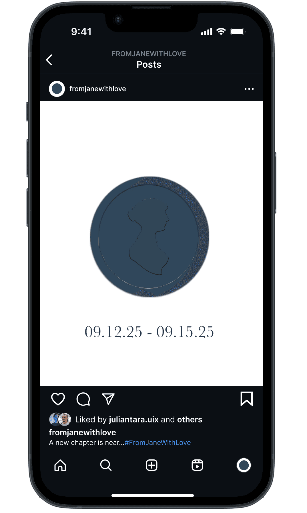
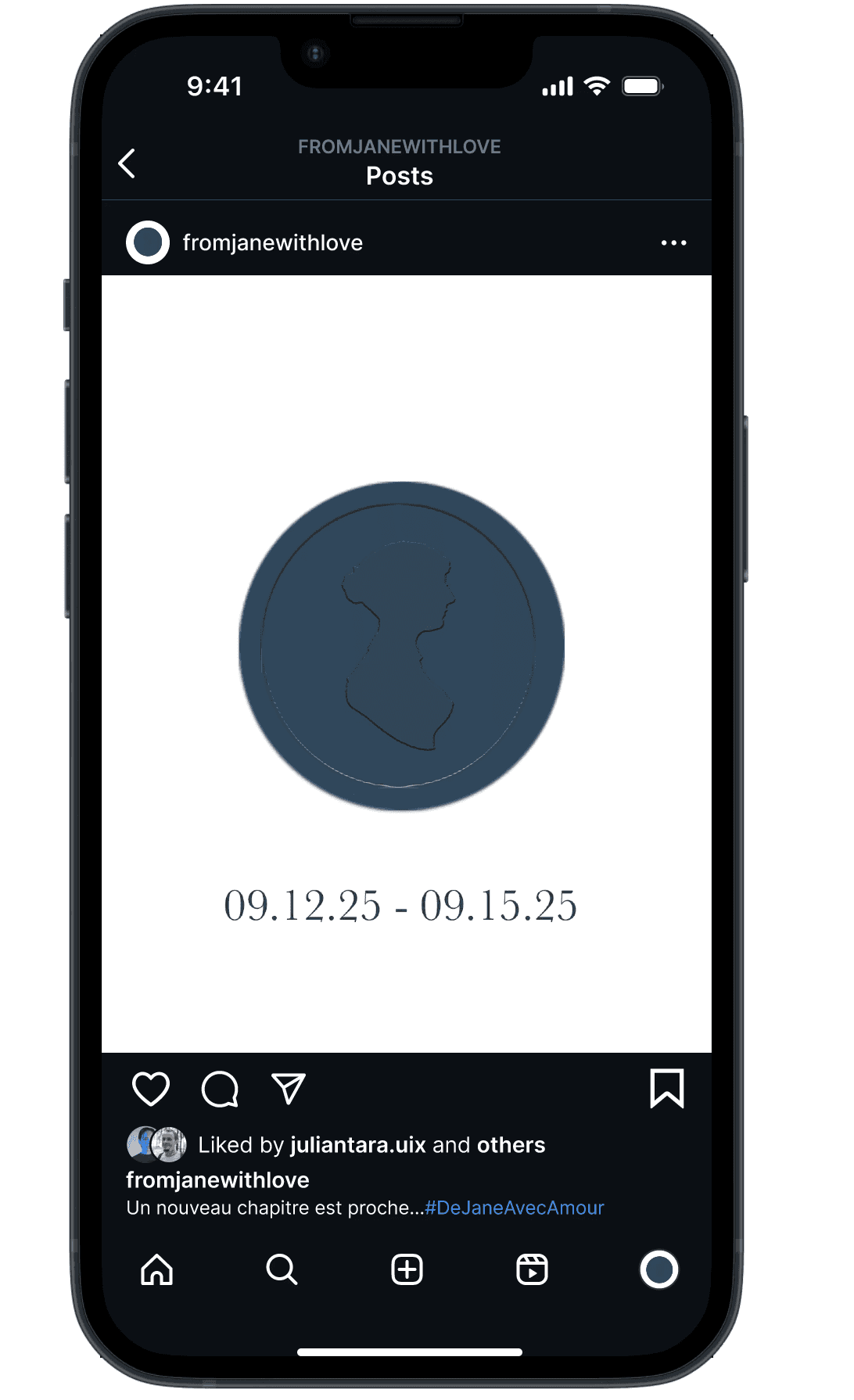
Yvette Flores
Graphic Design Portfolio


Problem
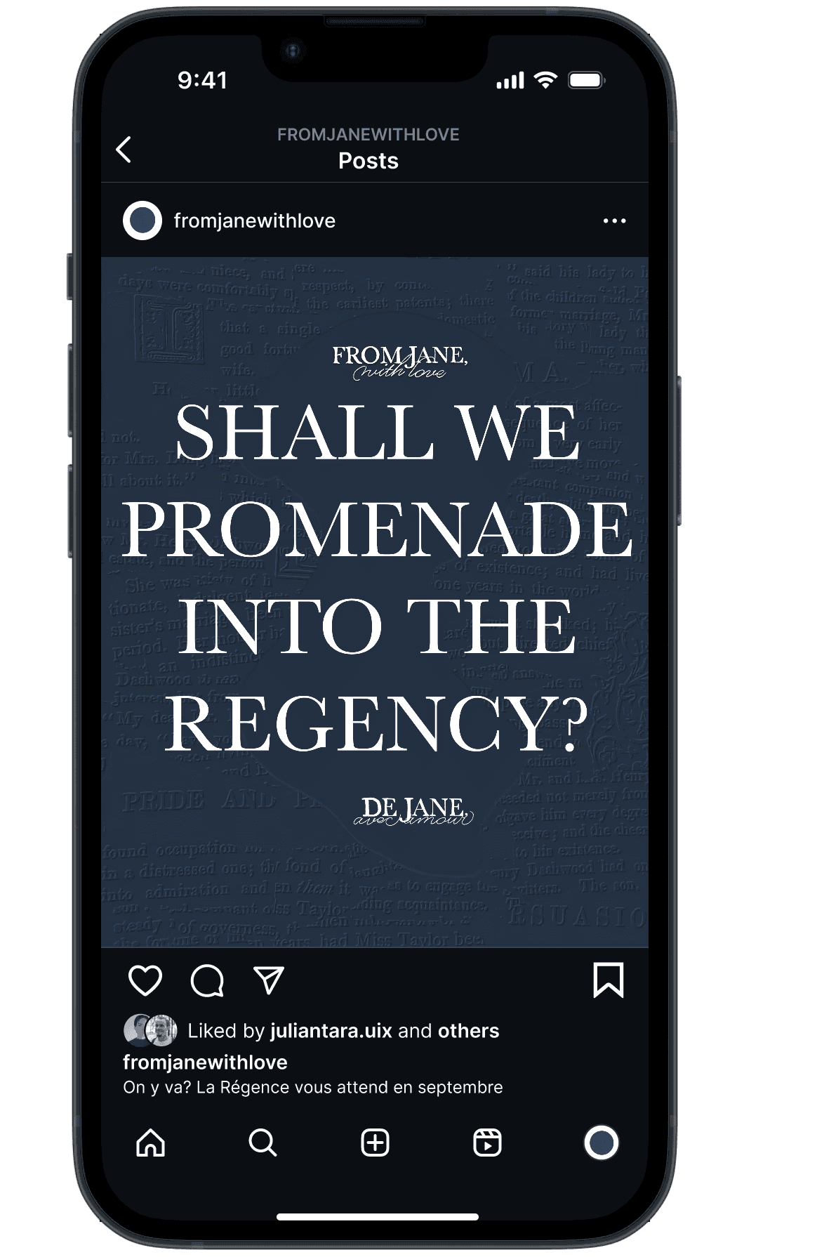
The existing Jane Austen Festival in Bath, England, received feedback that it did not fully celebrate Jane Austen herself. While marketed as an Austen-focused event, attendees felt it relied heavily on Regency-era stereotypes and traditions, rather than highlighting Austen’s life, work, and novels. The festival felt more like a general period showcase than a true celebration of the author.
Solution
To address this, I designed a festival that centers Jane Austen and her work:
Immersive Entrance & Exit: Visitors enter through a book arch made of actual Jane Austen novel pages, symbolically stepping into her world, and exit through a similar arch, returning to the present.
Regency Atmosphere with Austen Touches: Period costumes, architecture, and signage immerse visitors in the era while highlighting elements from Austen’s life and novels.
Themed Workshops & Experiences: Letter-writing workshops, Regency balls, and themed breakfasts inspired by her novels ensure the festival is about Austen, not just the era.
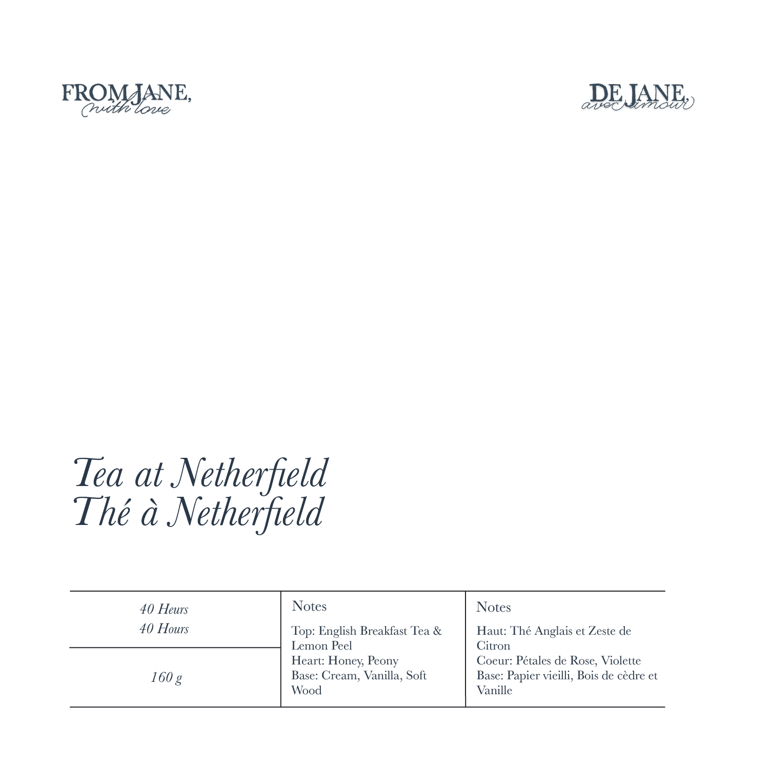
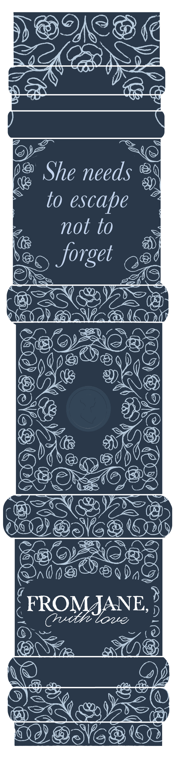
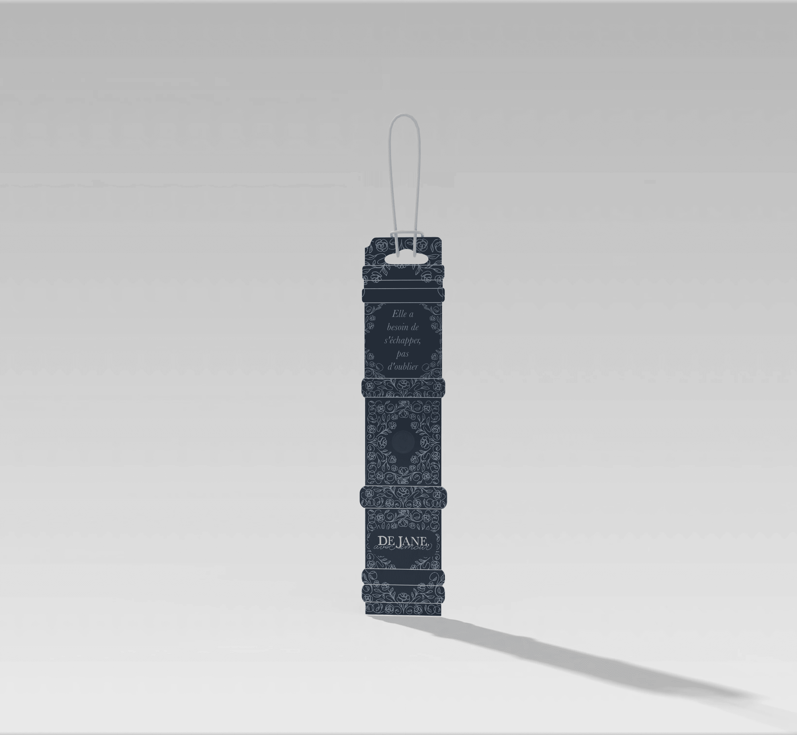
Branded Touchpoints: Maps, merchandise, and welcome boxes feature Austen-inspired design elements, making her presence felt throughout the festival
Festival Staff
Festival Volunteers
Their needs:
Clear, easy-to-identify uniforms or badges so attendees can quickly recognize staff
Quick access to event information to confidently assist guests
Materials that communicate professionalism and approachability, while remaining consistent with the Regency-inspired theme
Festival Attendees
Their needs:
An immersive, visually rich experience that feels like stepping into a Jane Austen novel.
Simple and intuitive access to schedules, maps, and activity information.
Memorable, collectible keepsakes that extend the experience beyond the event.
Engaging and thoughtful pre-festival marketing that builds excitement and anticipation.
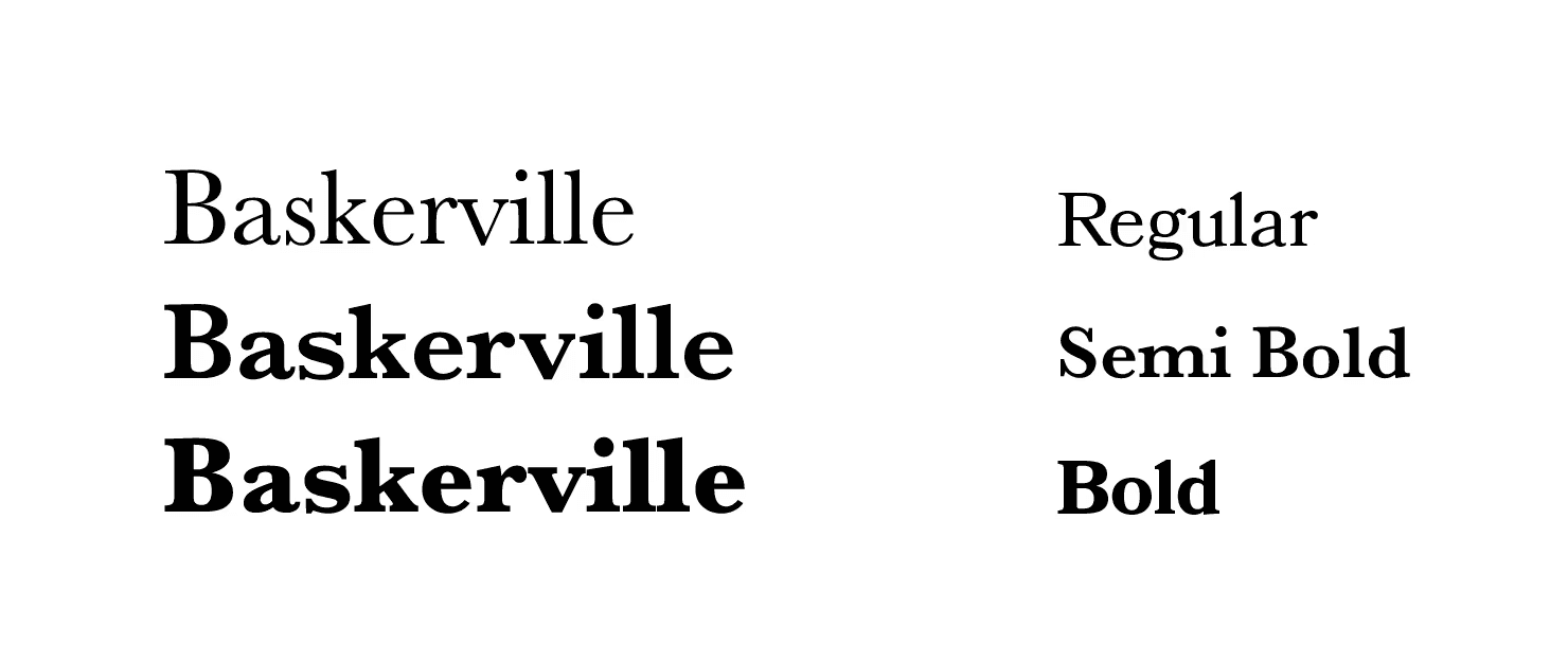

I used Baskerville, a serif typeface designed in the 18th century and widely used during Jane Austen’s lifetime. Its refined contrast and balanced proportions embody the same sense of grace and intelligence found in Austen’s writing.
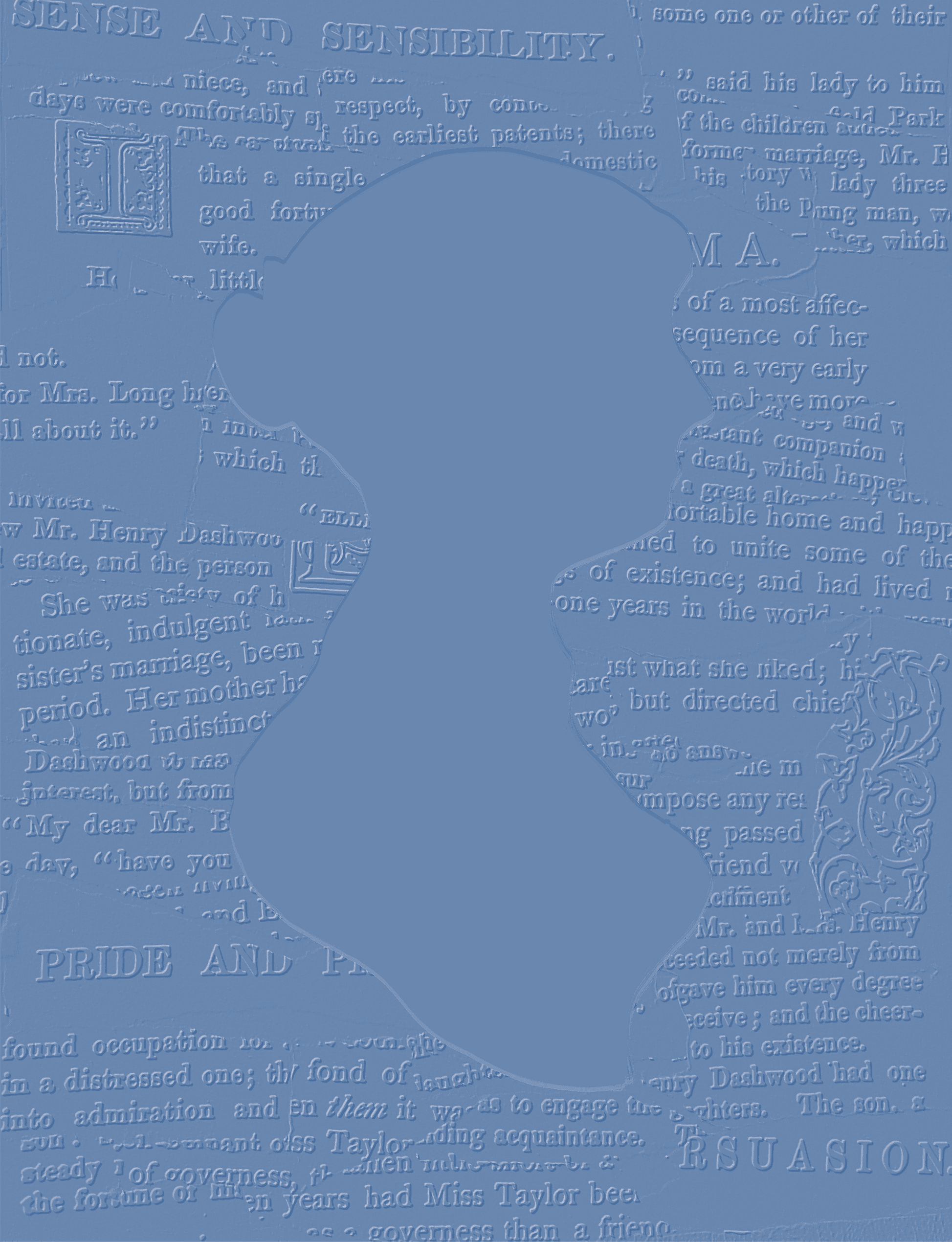


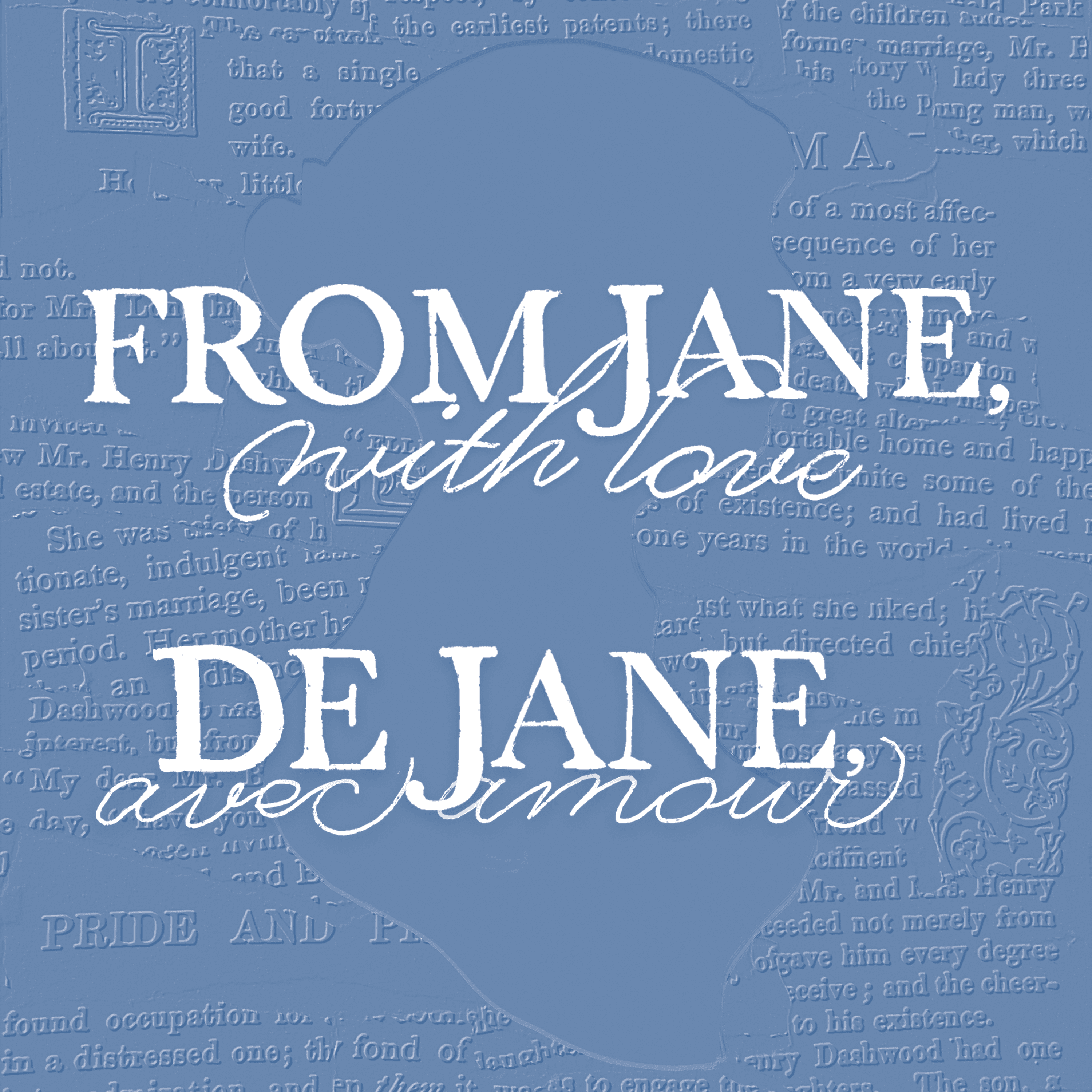
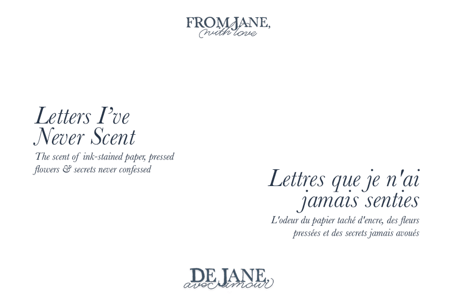
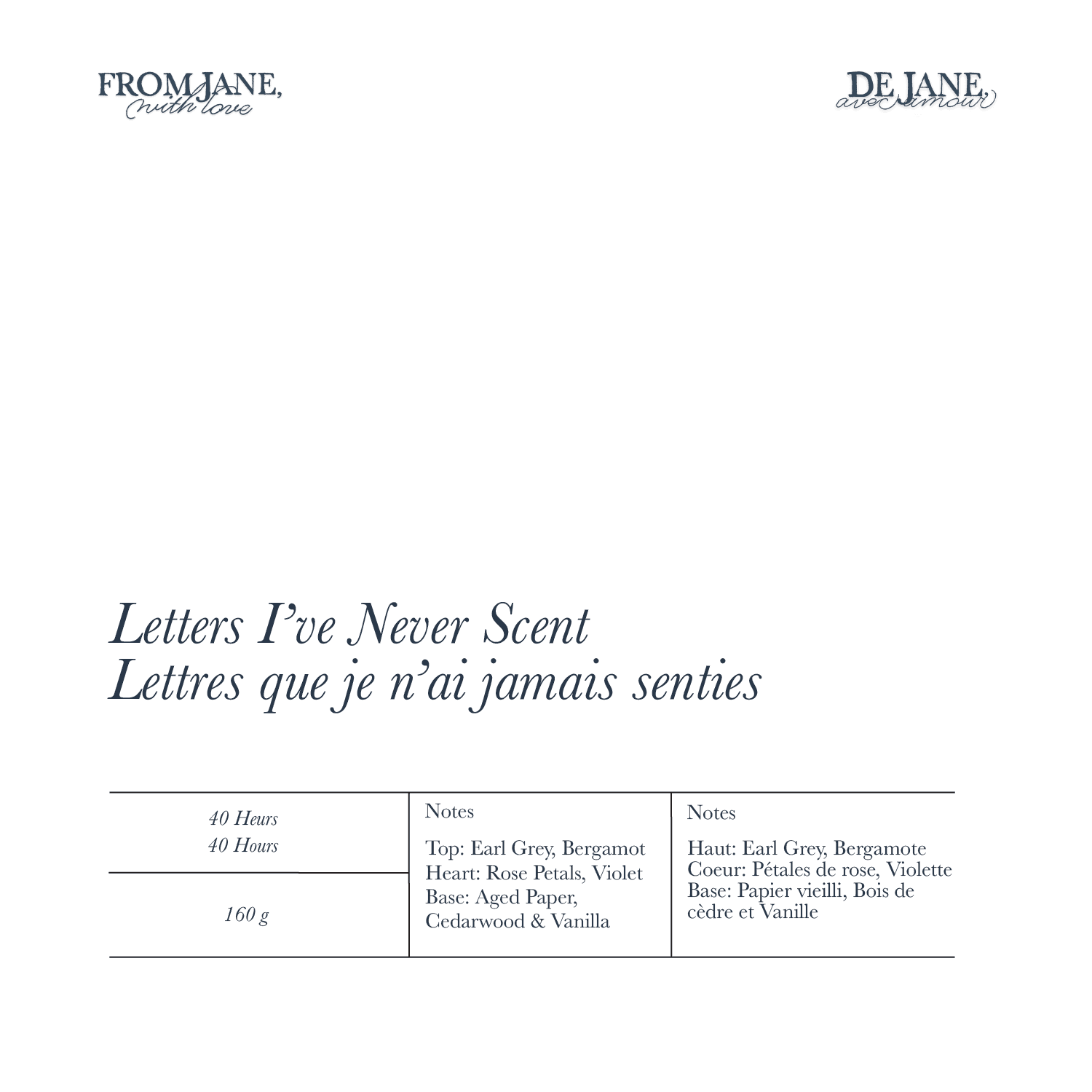
Constructed from scanned pages of Jane Austen’s novels. These pages were physically assembled, digitized, and treated with an embossed effect to create a layered, textured surface.


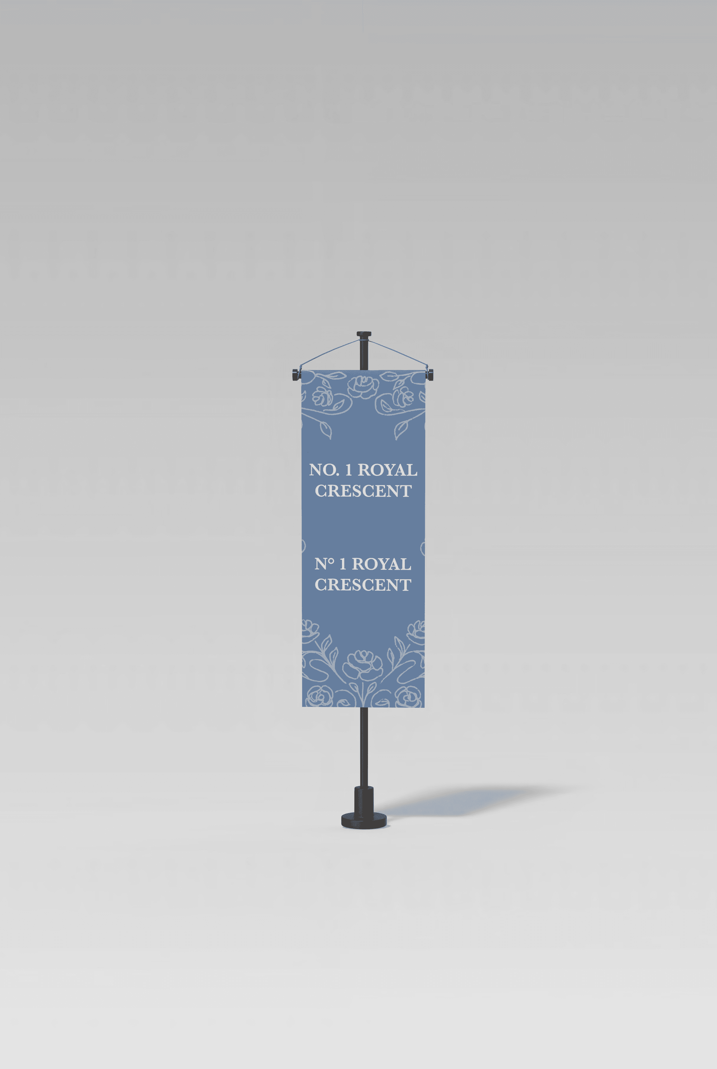


Festival Identification

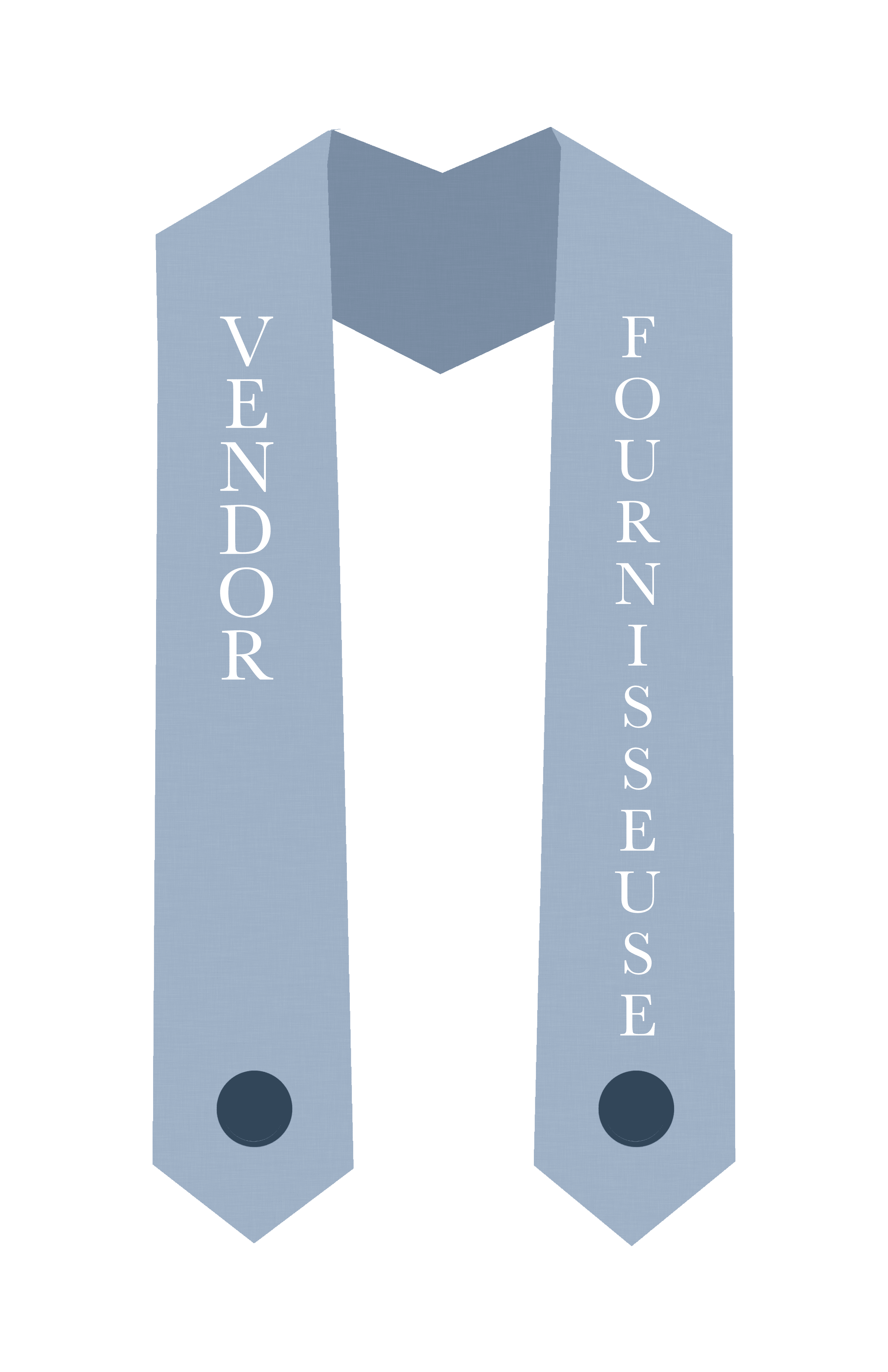

I designed bold linen sashes for staff, vendors, and volunteers as an alternative to traditional lanyards. Their high visibility makes it easy for attendees to identify who to approach from a distance. The linen material reflects the importance of textiles in the Regency era and aligns seamlessly with the festival’s aesthetic. Each sash is finished with the festival crest at the bottom, reinforcing the Jane Austen theme throughout the event experience.


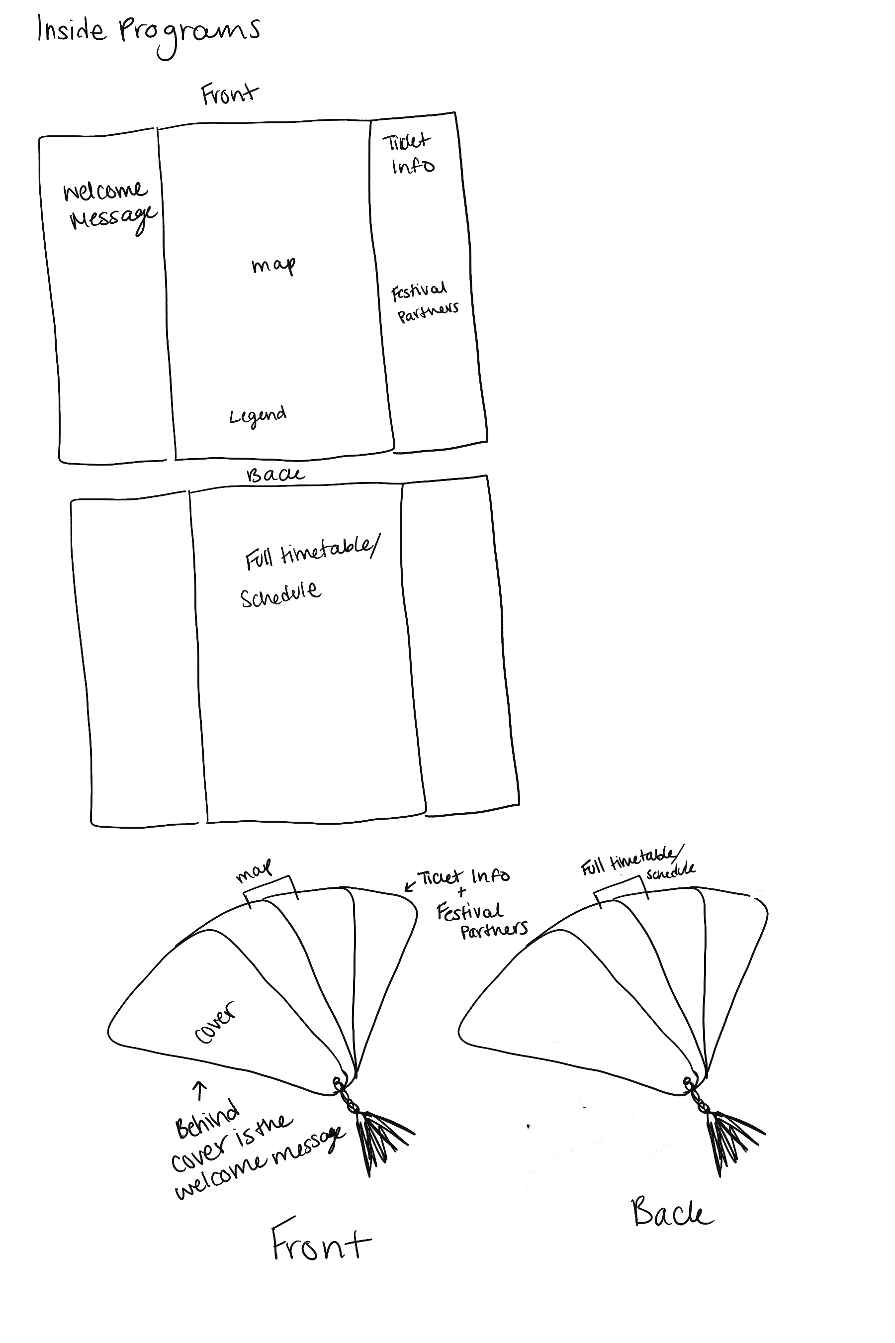

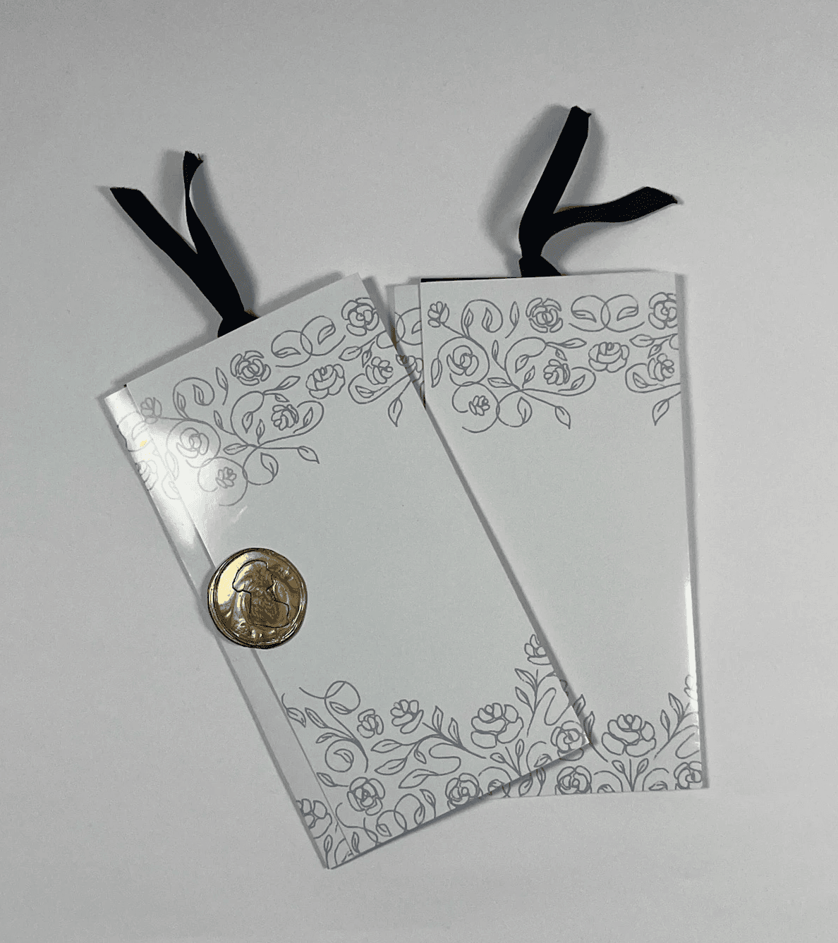


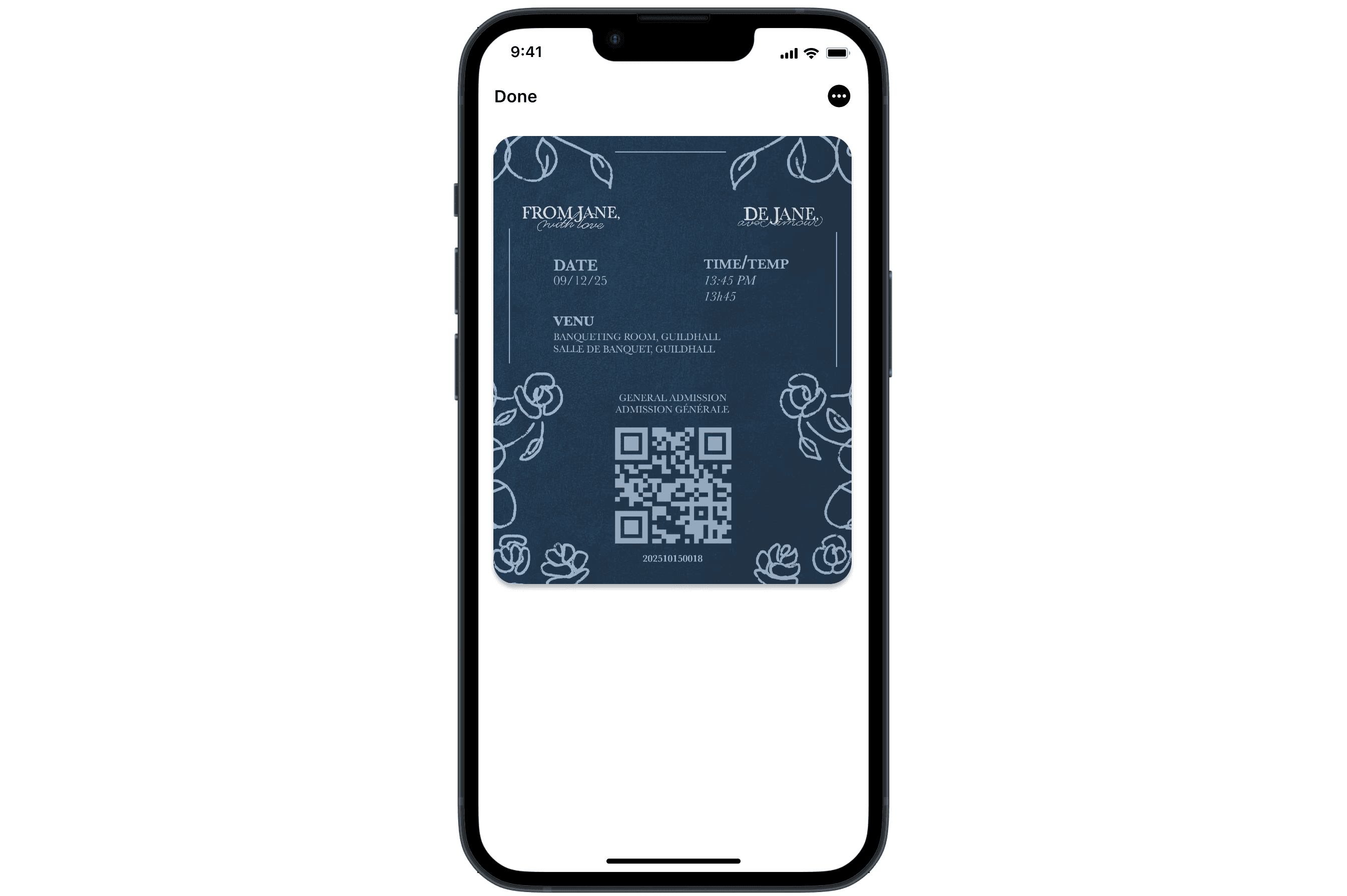
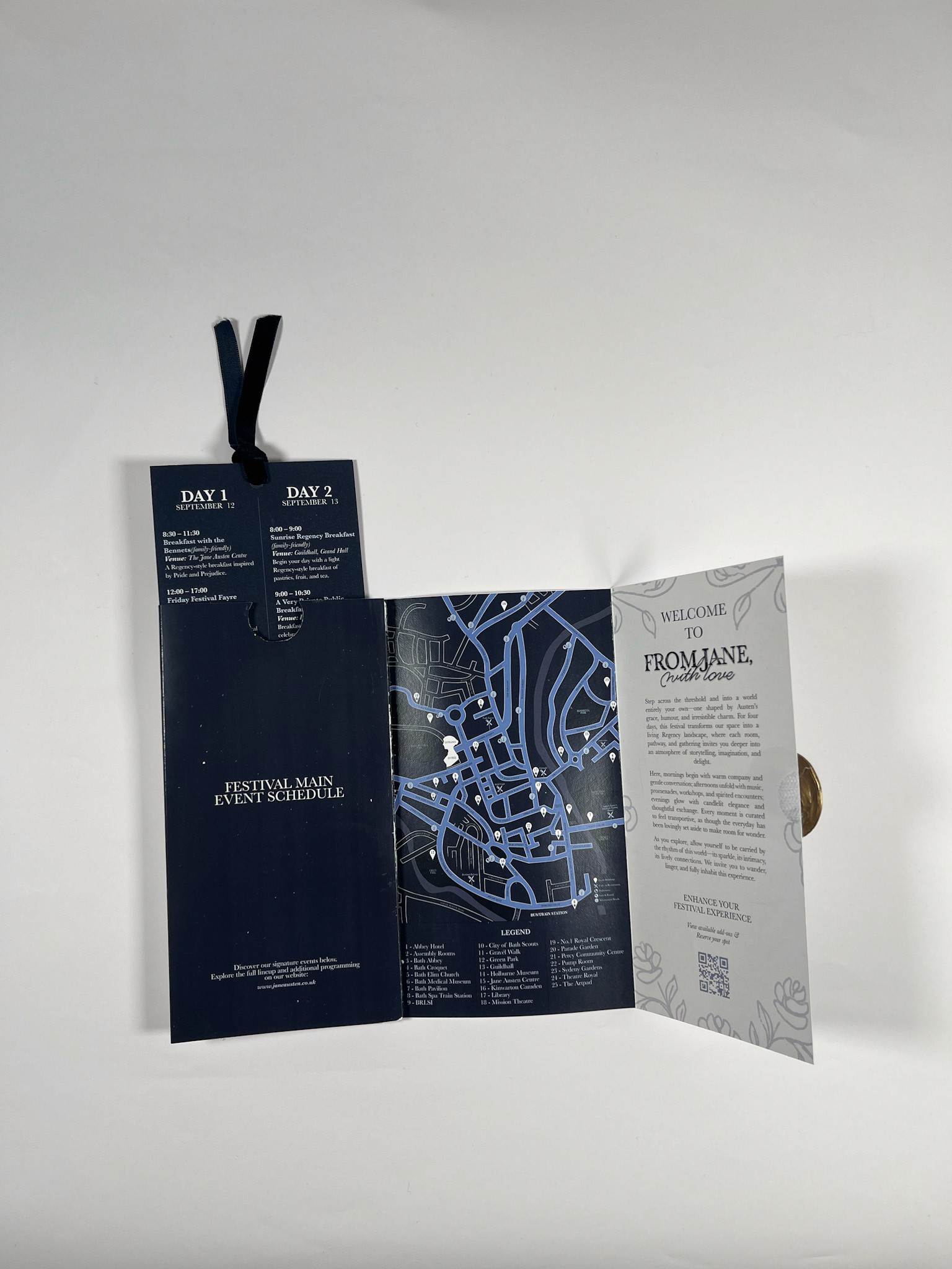
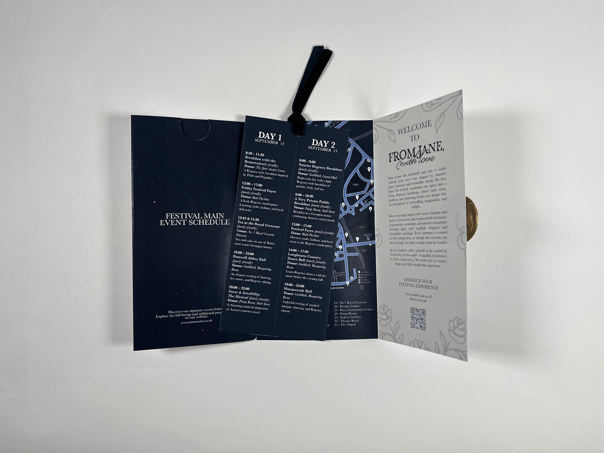
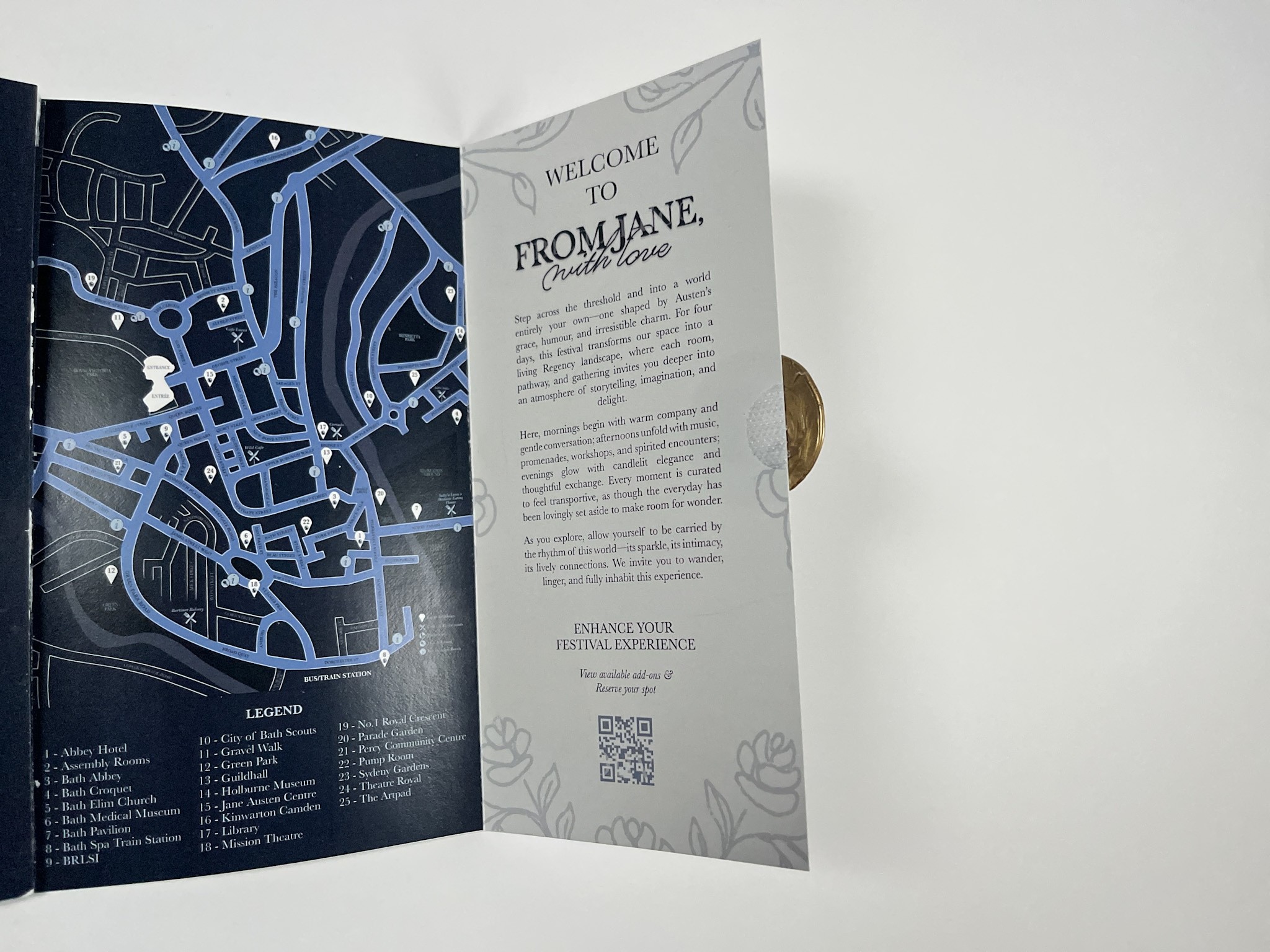
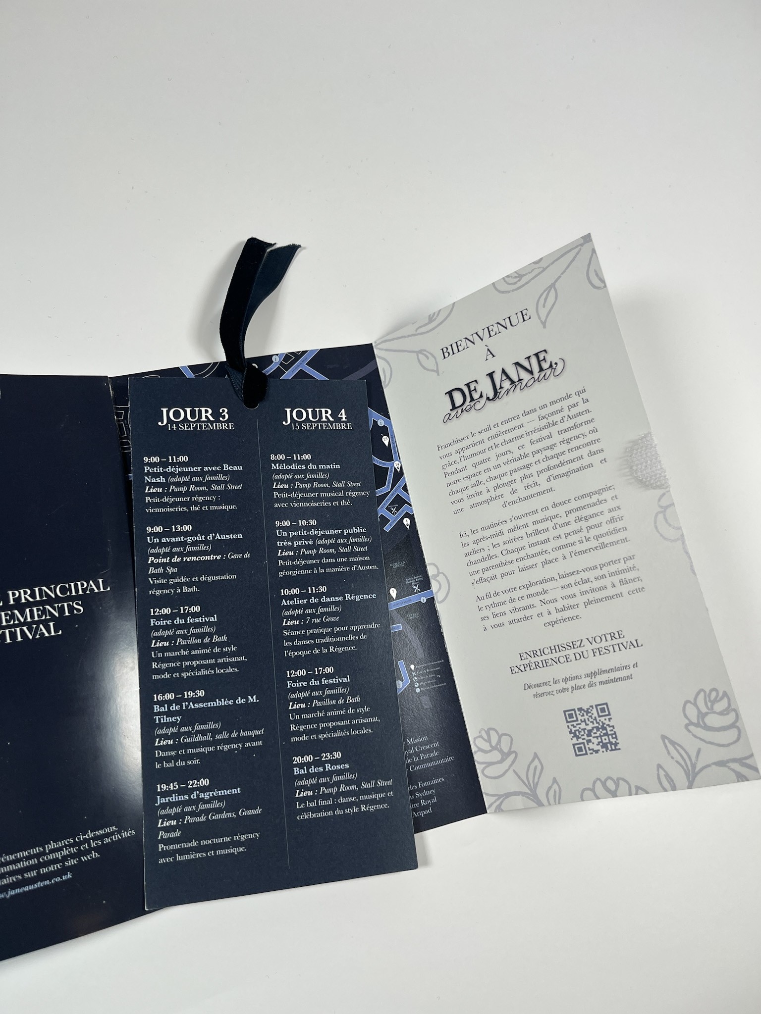
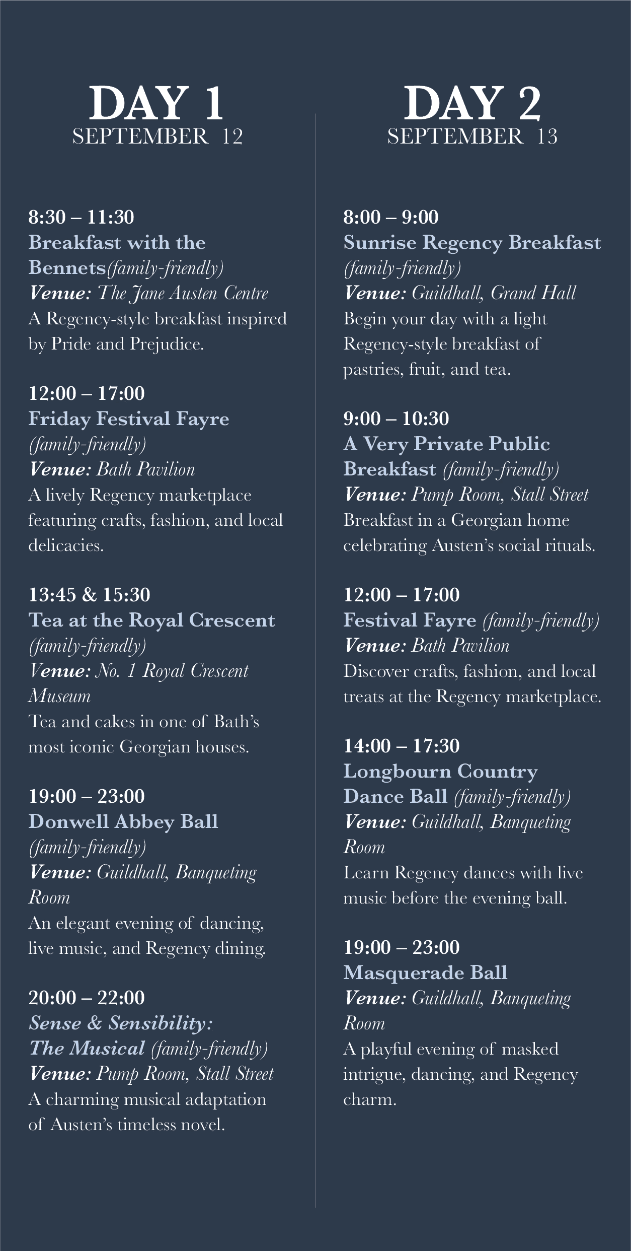
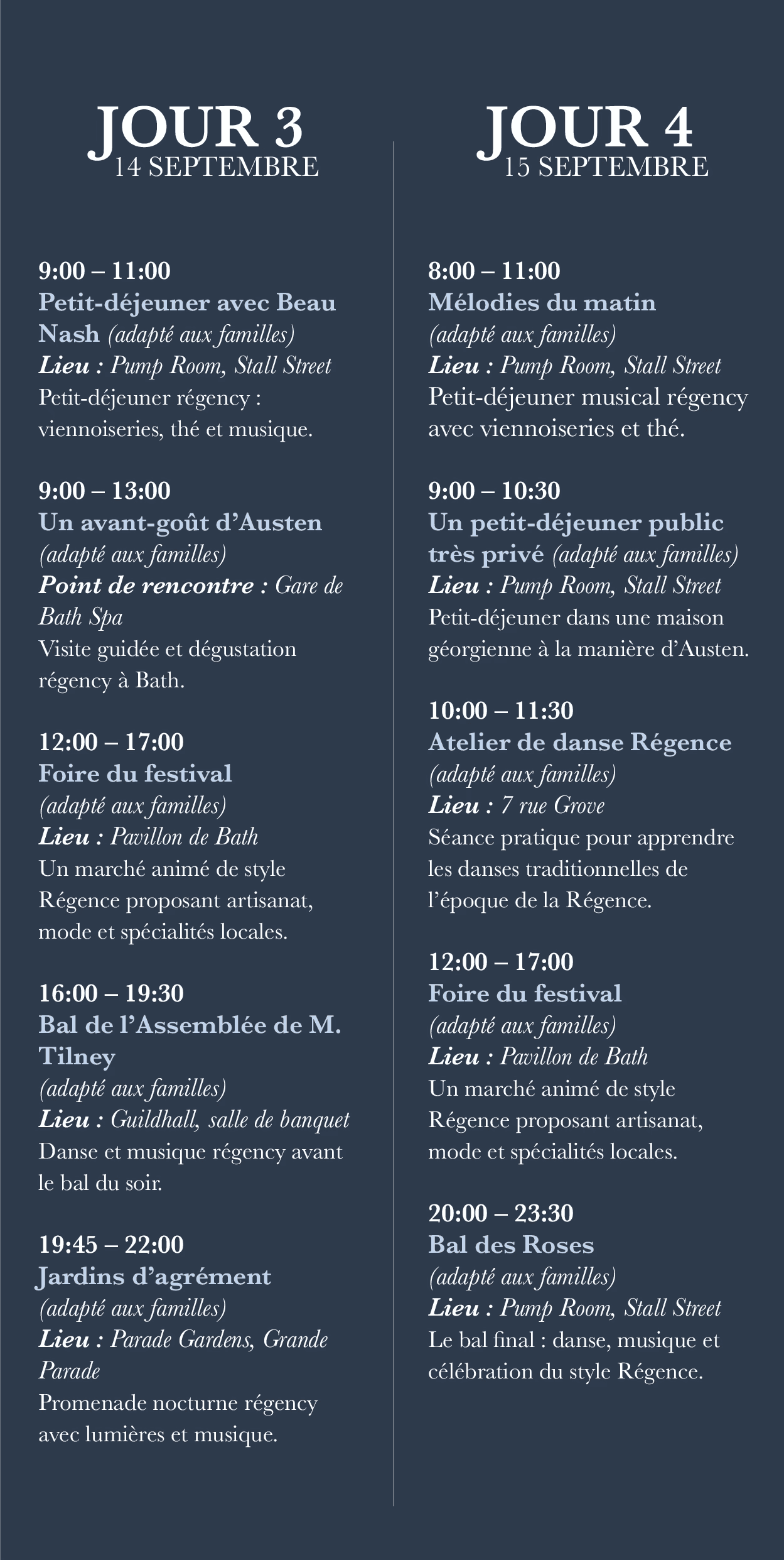
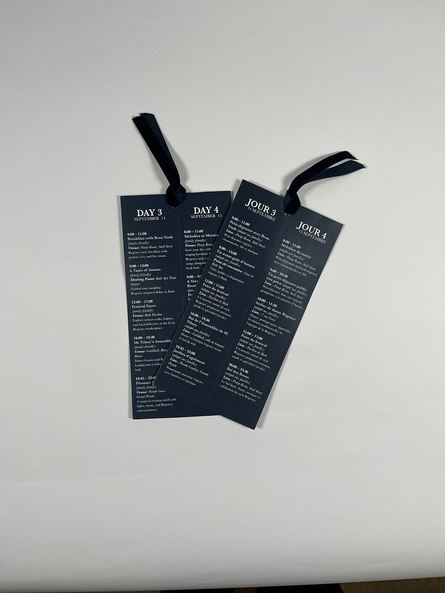
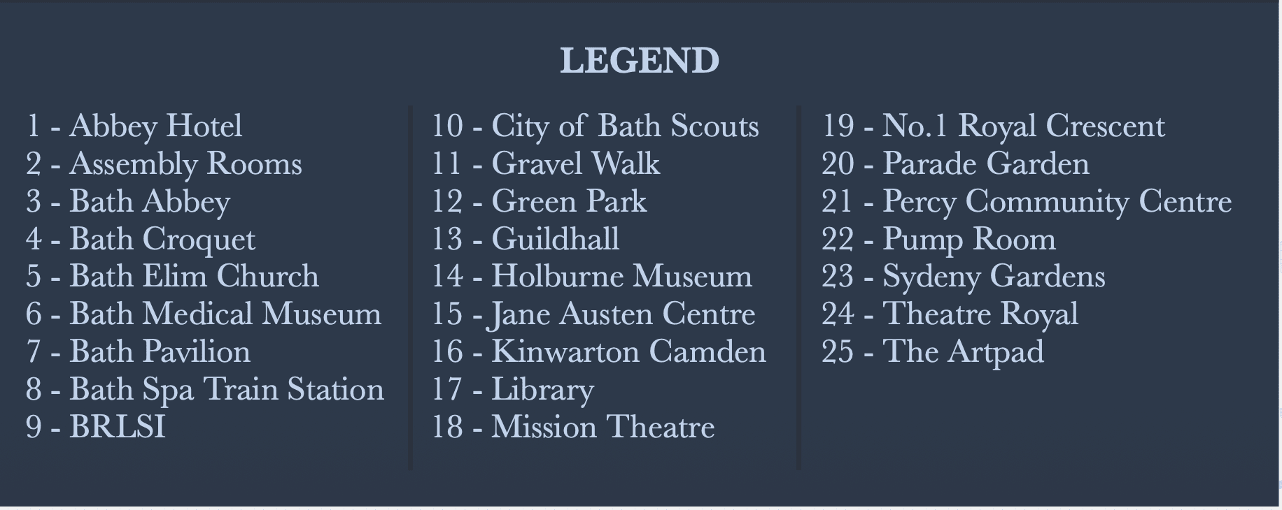
For the program, I focused on creating a thoughtful user experience from the moment it’s opened. Participants are greeted with a welcome message paired with the From Jane, With Love floral pattern, setting a refined Regency tone. To support easy navigation, I added a QR code for quick activity registration, a clear daily pull out schedule highlighting the five main events, and a simplified festival map with a legend so guests can find key locations easily.
The envelope-style format, sealed with Jane Austen’s emblem, adds a sense of ceremony. A Velcro attachment makes the program easy to open and close, blending tactile charm with practical usability.


French Program


English Map
French Map

Festival Apparel
For the festival apparel, I designed pieces that feel like real clothing—wearable, stylish, and suitable year-round—not typical branded festival merch. The designs draw inspiration from Jane Austen’s stories and letters, emphasizing literary and emotional themes.

Festival T-Shirt Pattern


The hoodie features a reimagined quote from Persuasion (1870): “You pierce my soul. I am half agony, half hope,” adapted to emphasize connection, intimacy, and emotional vulnerability. In the design, “pierce my soul” is highlighted in red, while “agony” is crossed out and replaced with “love,” and “hope” is crossed out and replaced with “yours.”
This transformation turns the original quote into a celebration of love, vulnerability, and heartfelt expression. The hoodie’s design, combined with its comfortable, wearable form, allows festival-goers to carry a piece of Jane Austen’s emotional depth with them, blending literary homage with everyday fashion.


The festival’s main sponsorship featured a limited-edition collaboration with Cortado Café in central Bath, conveniently located near festival events. This partnership offered exclusive drinks inspired by Jane Austen and the charm of Regency-era Bath, with latte and coffee art incorporating literary and Regency motifs.
Special edition mugs and merchandise were also available for purchase, creating a collectible experience for attendees. The collaboration aimed to blend literary charm, local heritage, and café culture, providing festival-goers with a unique and memorable way to engage with the spirit of the Jane Austen Festival.
The festival welcome box is designed to create excitement from the moment it is received. The top of the box features the festival emblem paired with a floral abstract pattern, setting a tone of elegance and anticipation. Inside, attendees are greeted with a decorative pattern and the festival title presented in both English and French—From Jane, With Love and De Jane, Avec Amour—highlighting the bilingual nature of the event and reinforcing its inclusive, celebratory atmosphere.


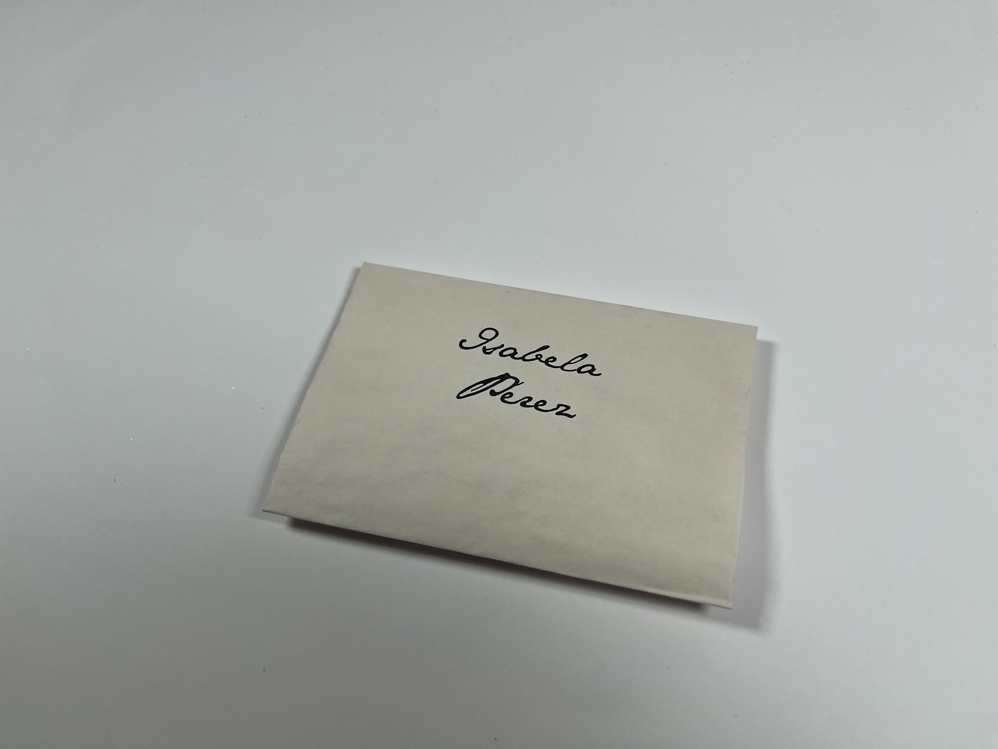
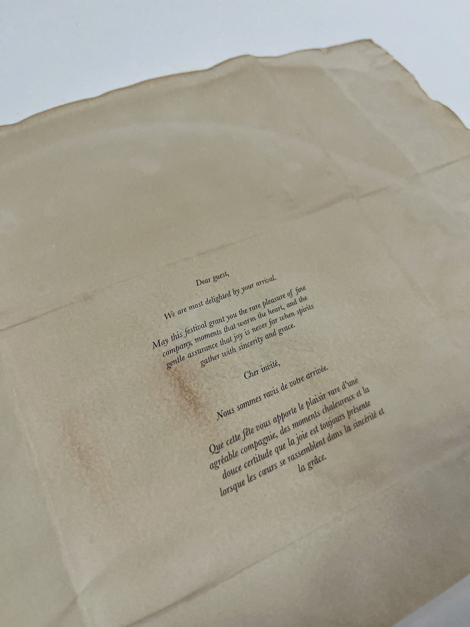
Like any welcome box, this includes a welcome letter, but it is specially designed for guests who purchased advance tickets to build excitement before the festival begins. The letter is styled after Jane Austen’s folded letters, mimicking the way she would fold her correspondence. To enhance the vintage, Regency-era feel, the letter is tea-stained, immersing recipients in a tactile, historical experience.


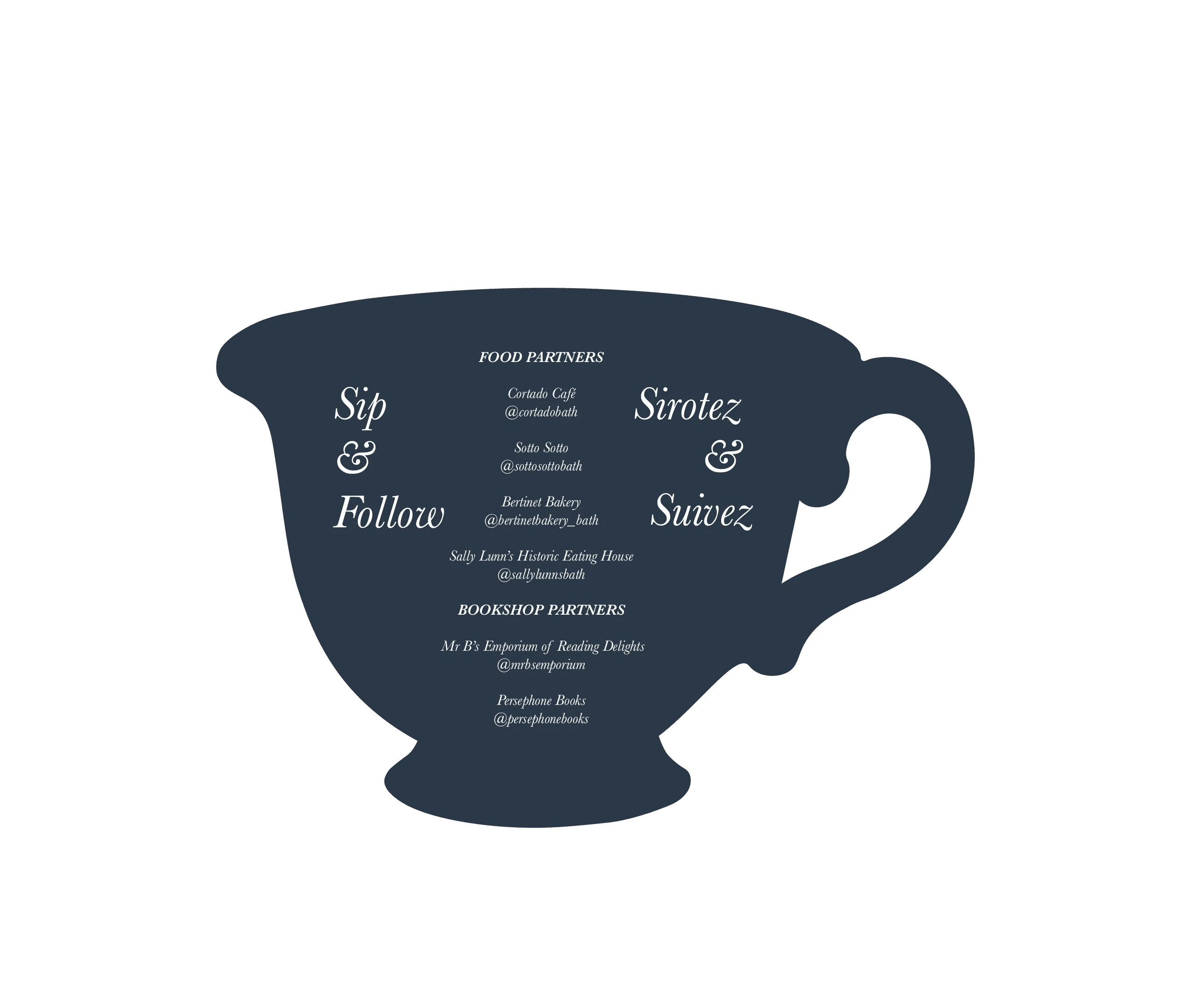
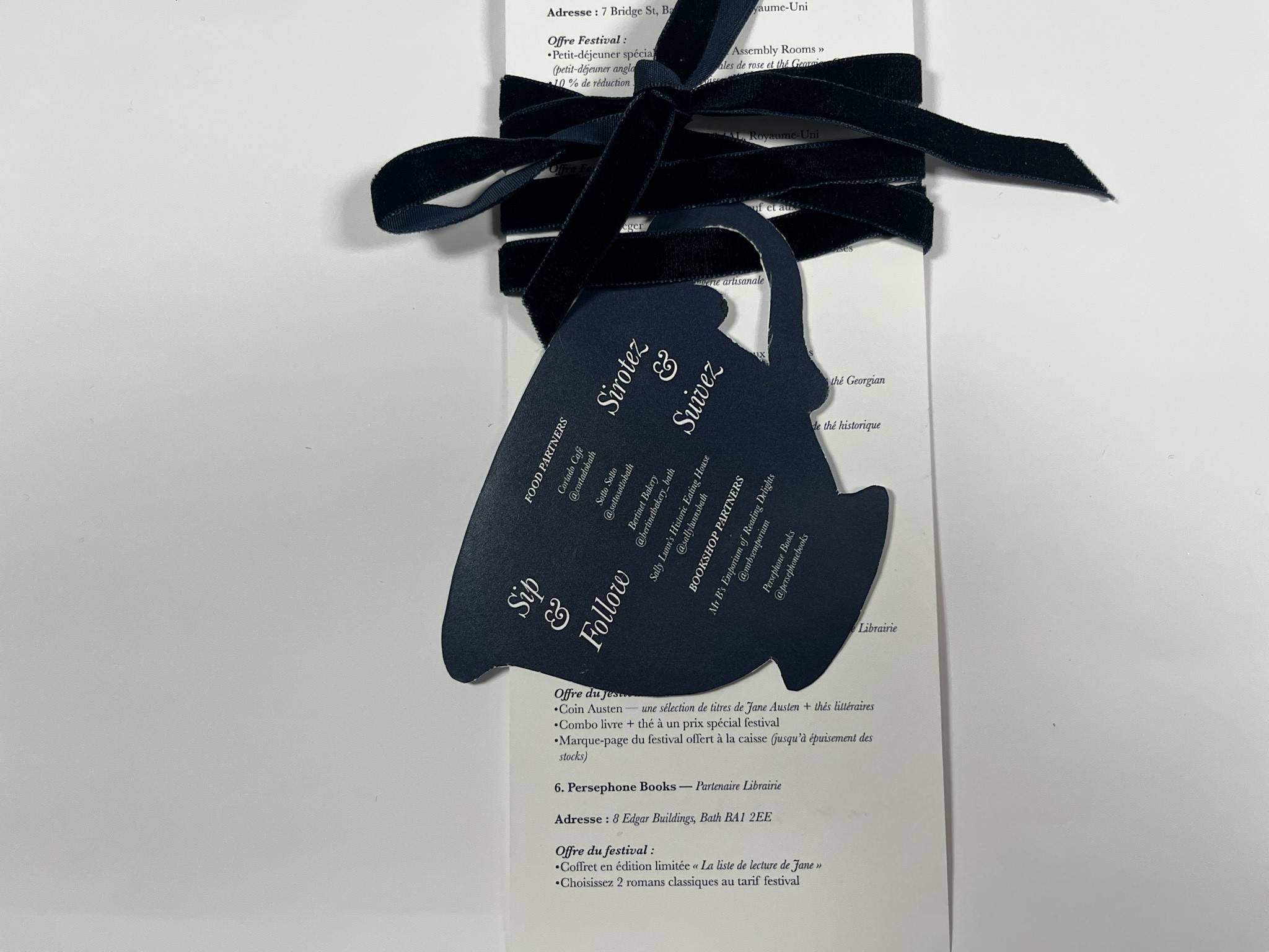
The Partner Card highlights the shops and restaurants collaborating with From Jane, With Love. It promotes special festival offerings (exclusive coffee blends or book sales) while also showcasing the partners themselves.
Final Mockup


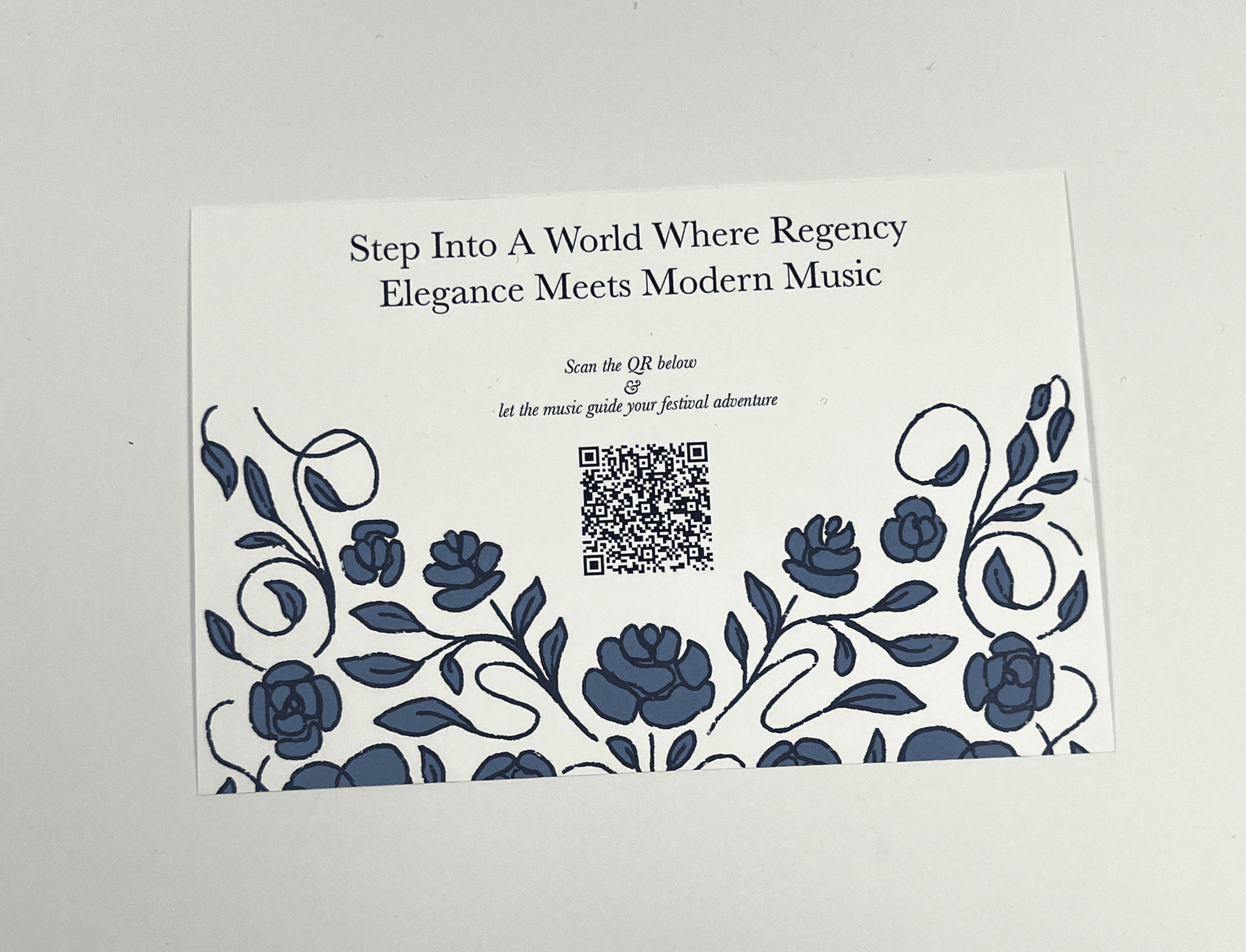
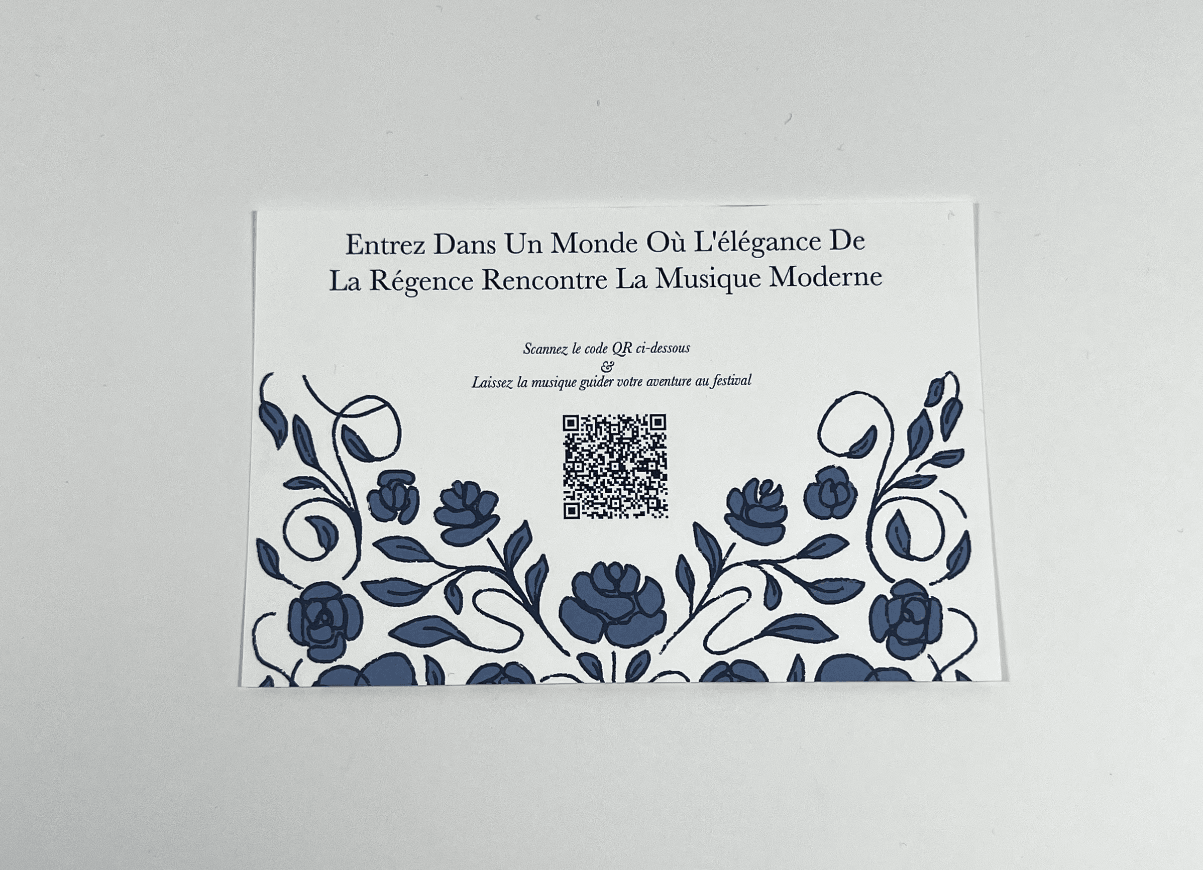
The Spotify card doubles as part of the welcome box. When scanned, it directs attendees to a pre-made playlist curated specifically for the festival. The playlist features modern orchestral music that blends contemporary sounds with Regency-era influences. Using modern tracks helps attendees feel connected while still evoking the elegance of the period.