Yvette Flores
Graphic Design Portfolio


Better Than The Movies
Book Cover Rebrand
A Fresh Look for a Page-Turning Romance
Overview
This passion project began with my love for Better Than the Movies by Lynn Painter—the book that pulled me into romance novels and remains one of my favourites. I’ve always been drawn to Painter’s writing style, her humour, and her unexpected plot twists, and this project became an opportunity to explore how those qualities could translate visually.
While the original cover is strong and widely appreciated, I wanted to challenge myself to reimagine it through a new perspective by creating a special-edition redesign. Although readers are often told not to judge a book by its cover, the cover is frequently the first point of connection—particularly for new or non-traditional readers. The goal of this redesign was to create a cover that feels slightly more mature while still preserving the charm, warmth, and accessibility of Young Adult romance.
Want to skip ahead?
The Finished Piece
Research Insight - Defining the Purpose of the Rebrand
Problem
Rebranding an Already Successful Cover
One of the main challenges of this project was rebranding a cover that is already well loved. Better Than the Movies has a strong visual identity and a clear connection to its audience, which made it difficult to identify what could be changed without taking away from what already works. Rather than solving an obvious design problem, the challenge became understanding the role of a rebrand when the original cover is already successful.
Standing Out in a Saturated YA Romance Market
YA romance is an extremely crowded and trend-driven category, with many covers relying on similar colour palettes, illustrations, and visual tropes. A key challenge was creating a design that felt distinctive and memorable without blending into existing market trends.
How can a redesign add value to a recognizable cover?
Solution
Reframing the Rebrand as a Special Edition
This challenge was resolved by reframing the project as a special edition rather than a replacement. Instead of trying to improve the original cover, the focus shifted toward creating something that felt additional and celebratory. Drawing inspiration from the book community’s appreciation for alternative and collectible editions, the redesign was approached as a new interpretation—one that honours the original while offering readers a different way to experience a story they already love.
Letting the Story Guide the Design
My solution began by rereading the book multiple times to reconnect with what makes it special—its humor, its romantic cliches, and its heartfelt references to classic rom-com movies. From there, I focused on letting the book itself guide the design rather than the market. The story is playful, romantic, and full of cinematic clichés, so I translated that into a chocolate box–inspired typographic cover. This approach allowed me to emphasize the emotional heart of the story.
Target Audience
Primary Audience - Rom-Com Book Lovers
Age Group
Women readers aged 13–25 years old (Young Adult to New Adult)
These readers gravitate toward cozy, trope-driven romance and often choose books based on emotional tone and overall aesthetic.
They are fans of romance titles such as To All the Boys I’ve Loved Before, and Love & Other Words, which balance humour, emotional depth, and familiarity.
Highly active within online reading communities, including BookTok, Bookstagram, and Pinterest, where aesthetics play a major role in discovery new reads.
Secondary Audience - Rom-Com Movie Fans
These readers are drawn to stories that feel cinematic and nostalgic, reminiscent of classic romantic comedies. They are attracted to covers that convey warmth, humour, and emotional comfort, favouring visuals that are playful yet refined and evoke a movie-like experience.
Secondary Audience - Aesthetic-Driven Buyers
This audience often purchases books as gifts and is drawn to visually appealing objects. Their decisions are influenced by colour palette, typography, and small tactile details. They are particularly attracted to designs that feel display-worthy, whether styled on a bookshelf, desk, or shared on social media.
Audience Needs
A cover that immediately evokes romance, comfort, and a sense of nostalgia.
Clear communication of the book’s tone and genre at first glance.
Visual elements that feel relatable to readers who enjoy romance and familiar tropes.
A design that appears considered, cohesive, and trustworthy.
Subtle references to romance tropes without giving away the story.
A visually engaging cover that feels worth sharing across digital platforms.
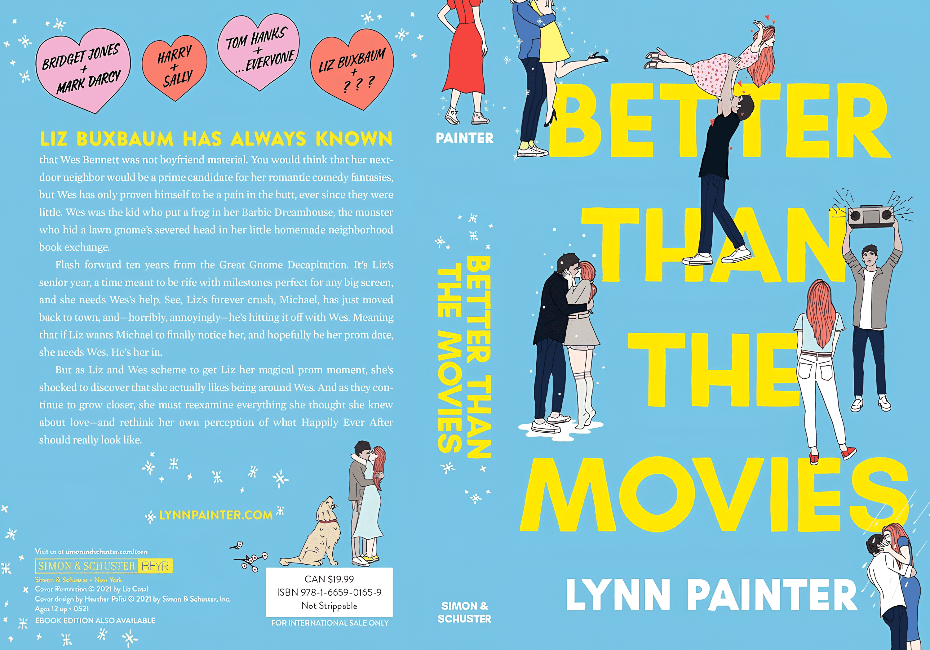
Original Book Design (2021)
Design Approach
75123A
D92C5A
F2809C
FFFFFF
75123A
D92C5A
F2809C
FFFFFF
Colour Palette
For this redesign, I chose a palette of pink and red tones, including bright fuchsia and warm reddish-pinks. These colours not only evoke romance and the playful energy of rom-coms, but they also create an immediately captivating visual impact.

Typography
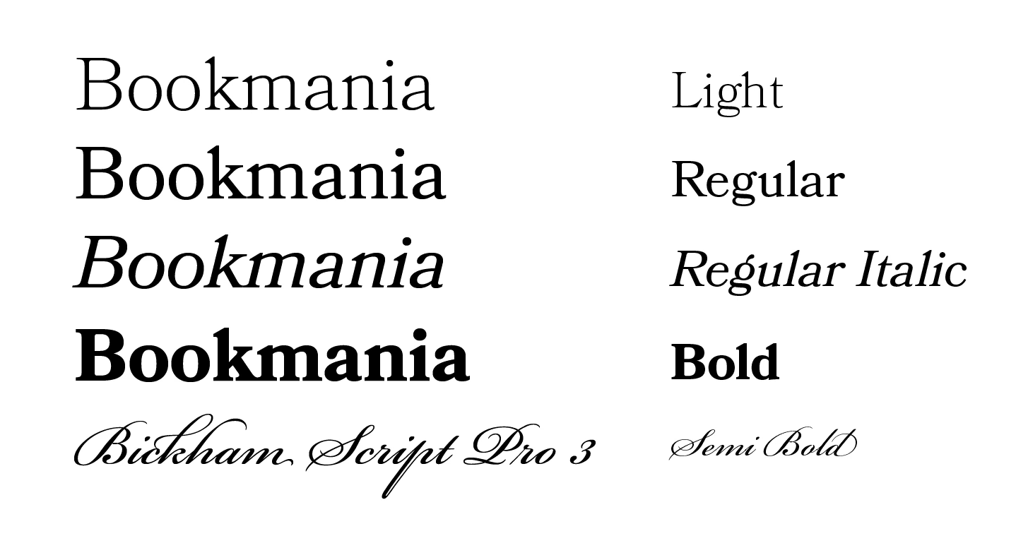
I used Bookmania, a serif font for the main text to convey romance and elegance, giving the cover a sophisticated yet inviting feel. To complement the chocolate box concept and playful rom-com clichés, I paired it with Bickham Script Pro 3, a decorative script, adding whimsy and visual interest while tying the design together.
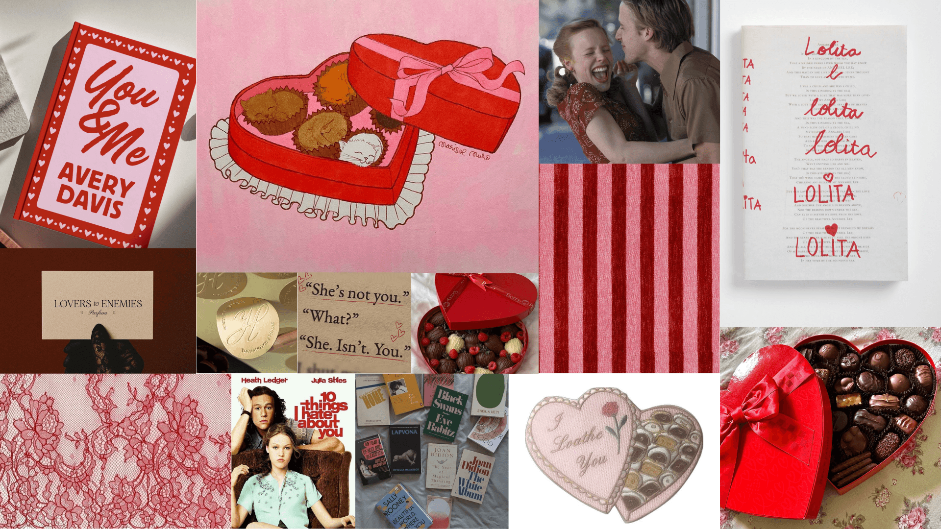
Mood Board
Sketches
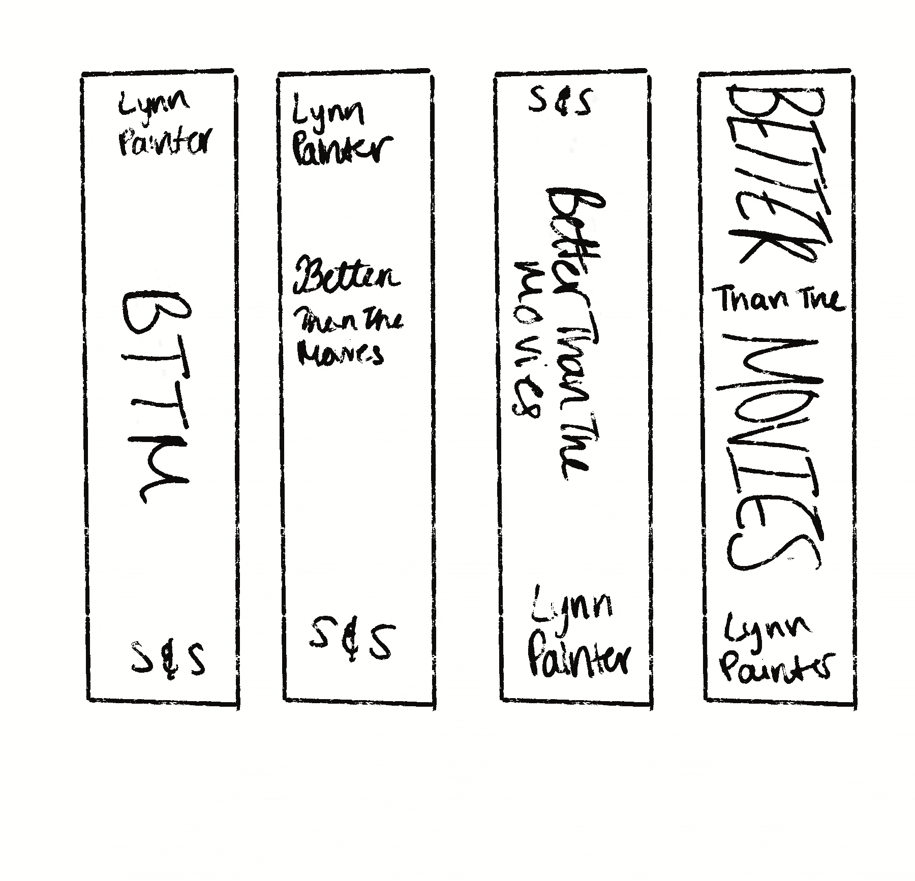
During the sketching phase, I used my mood board to help shape the overall direction of the designs, drawing from classic rom-com tropes and a feminine, playful aesthetic that reflects the tone of the novel. Much of this stage focused on exploring typography, where I experimented with different type styles, scales, and placements to make the title a primary focal point.
I also explored a range of layout options for the spine, with particular attention given to the readability and visual presence on a shelf. This phase involved a lot of trial and error, which allowed me to test ideas, refine proportions, and build a strong foundation for the final design.
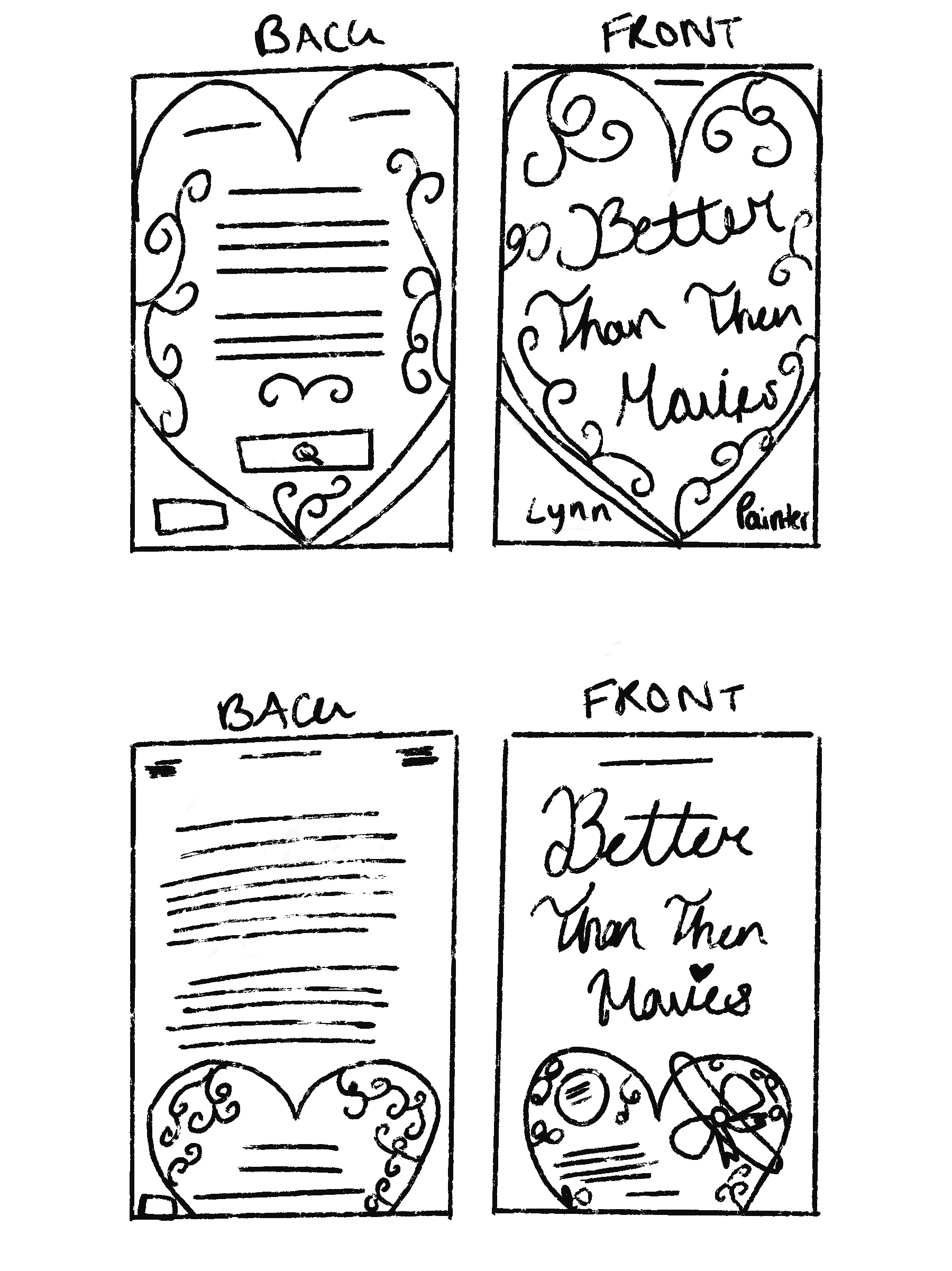
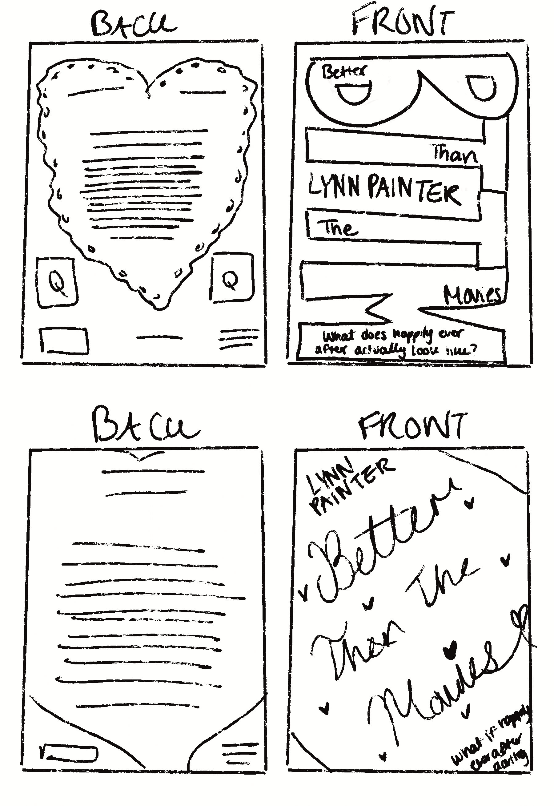
Draft 1
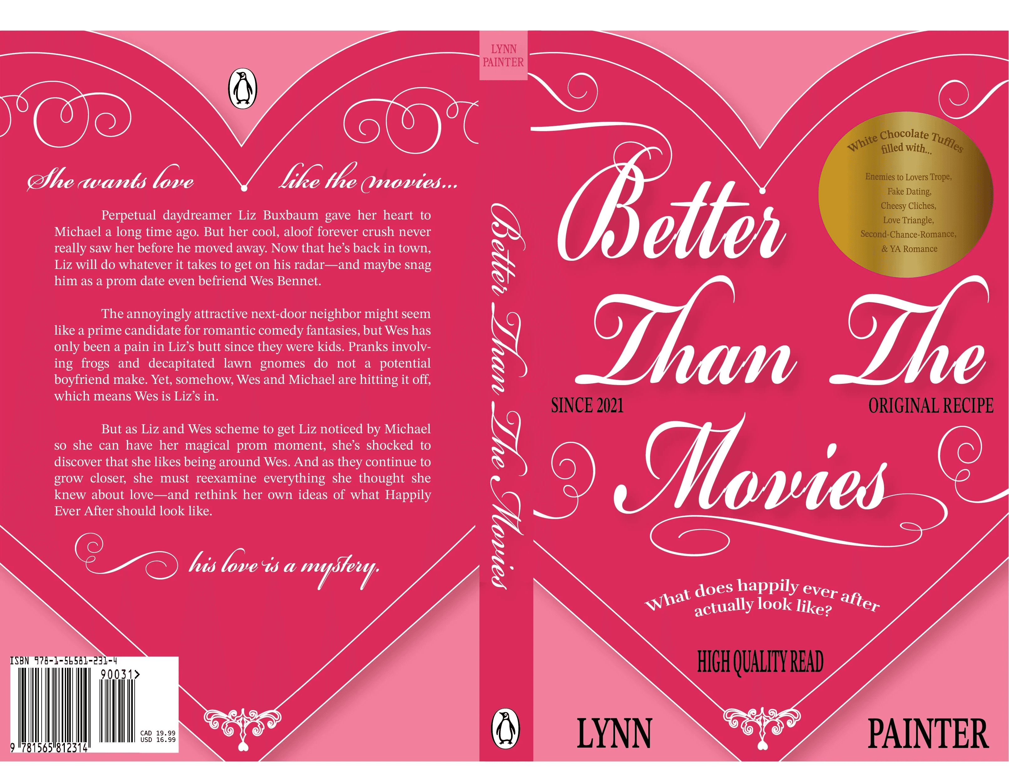
For the first draft, I explored the idea of reimagining Better Than the Movies as a chocolate box, playing on the notion of romance as something sweet, indulgent, and nostalgic. The front cover was designed to resemble the lid of the box, while the back functions as the underside, helping the book feel like a complete, physical object rather than a flat surface.
To further support the chocolate box concept, I introduced decorative elements such as ornamental linework, a circular “sticker,” and packaging-inspired text including “Since 2021,” “Original Recipe,” and “High Quality Read.” These details draw clear parallels between premium chocolate packaging and the story itself. The inclusion of trope references—such as enemies to lovers, fake dating, and cheesy clichés—was a deliberate way to communicate the book’s genre and themes in a playful and immediately recognizable way.
While the overall concept felt strong, this draft was intentionally exploratory. Decisions around publisher information, scale, and typography—particularly the use of black text—were not finalized and helped reveal what needed refinement. This first iteration ultimately served as a foundation, allowing strengths in the concept to emerge and guiding the direction of later, more resolved designs.
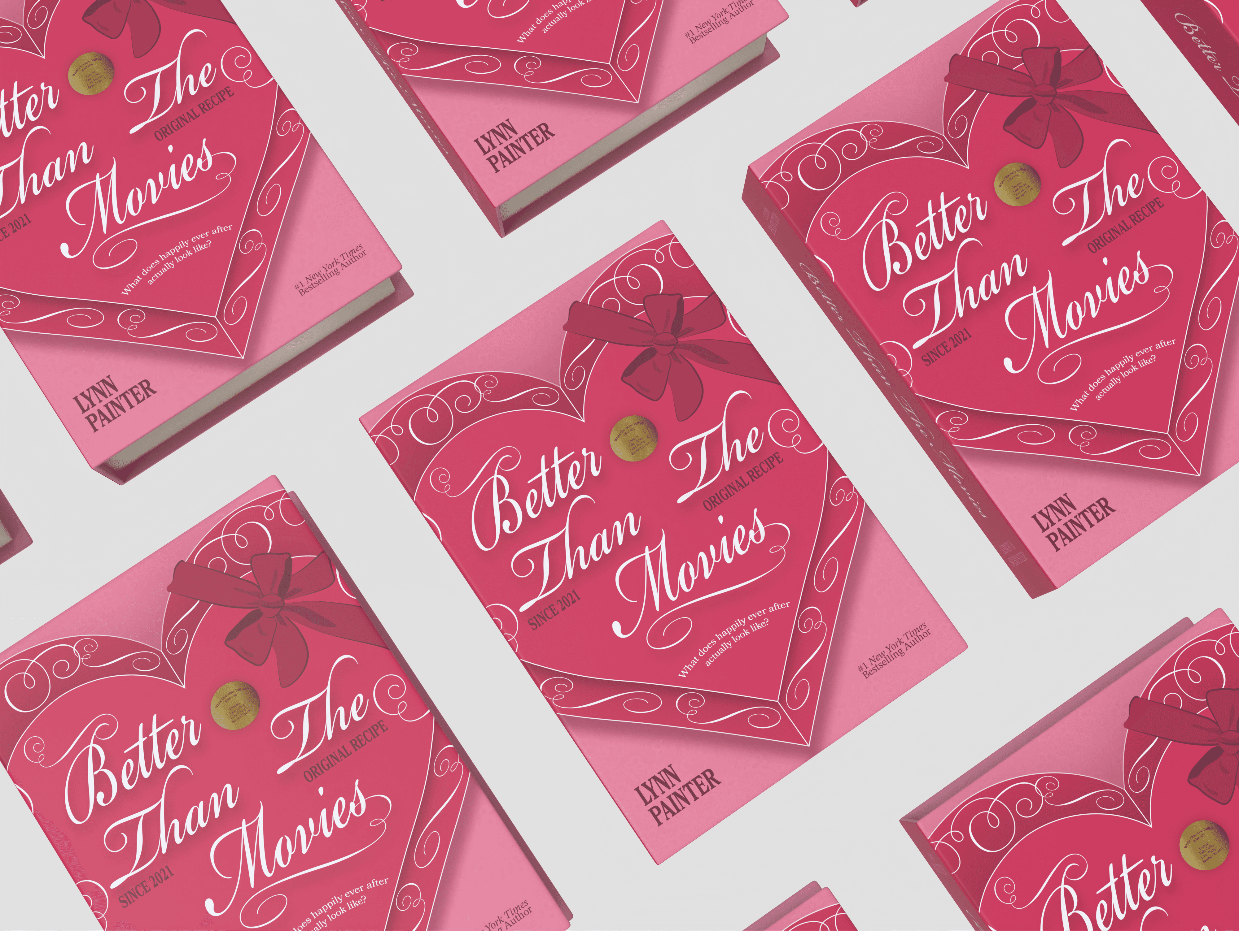
Finalized Book Cover
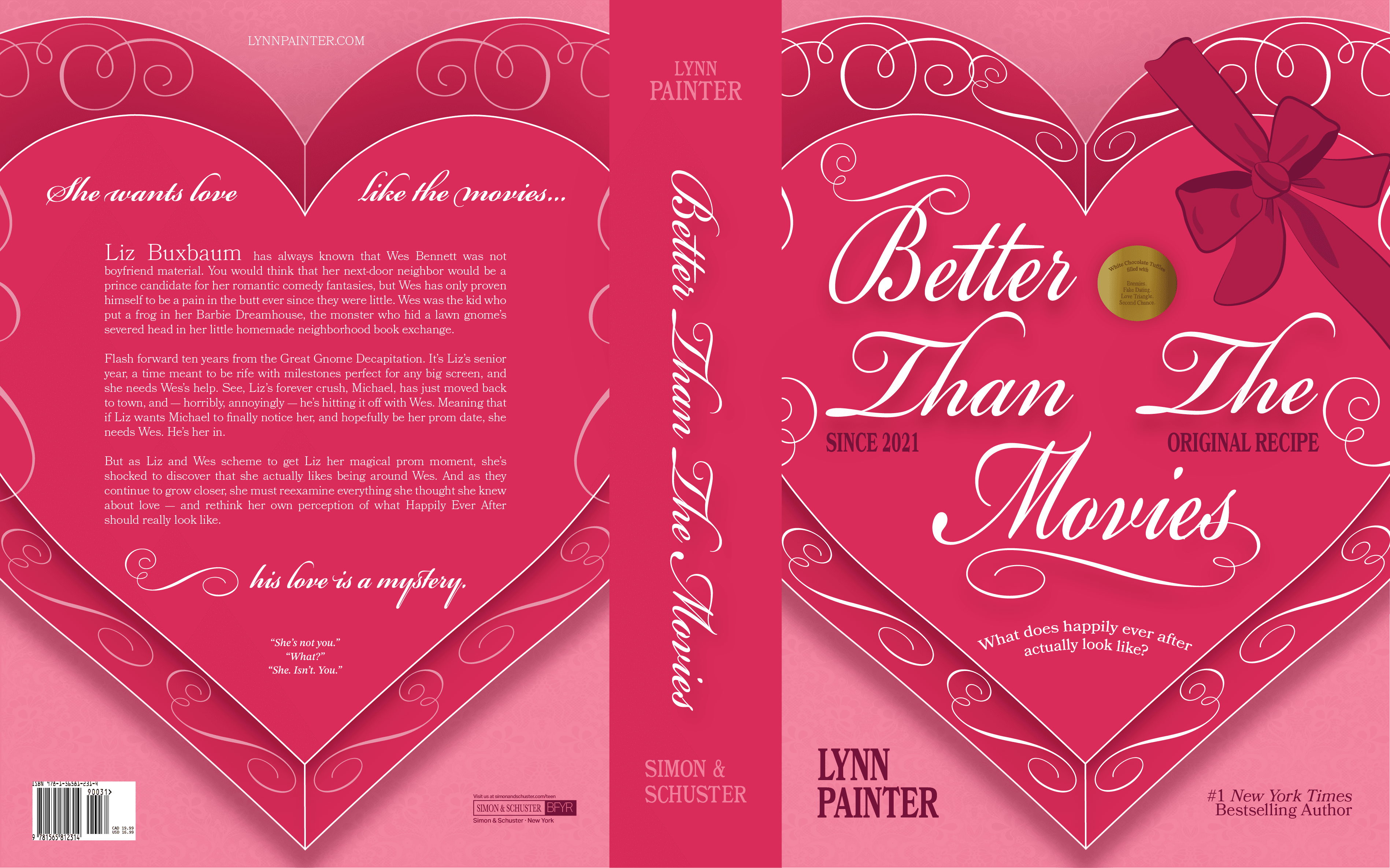
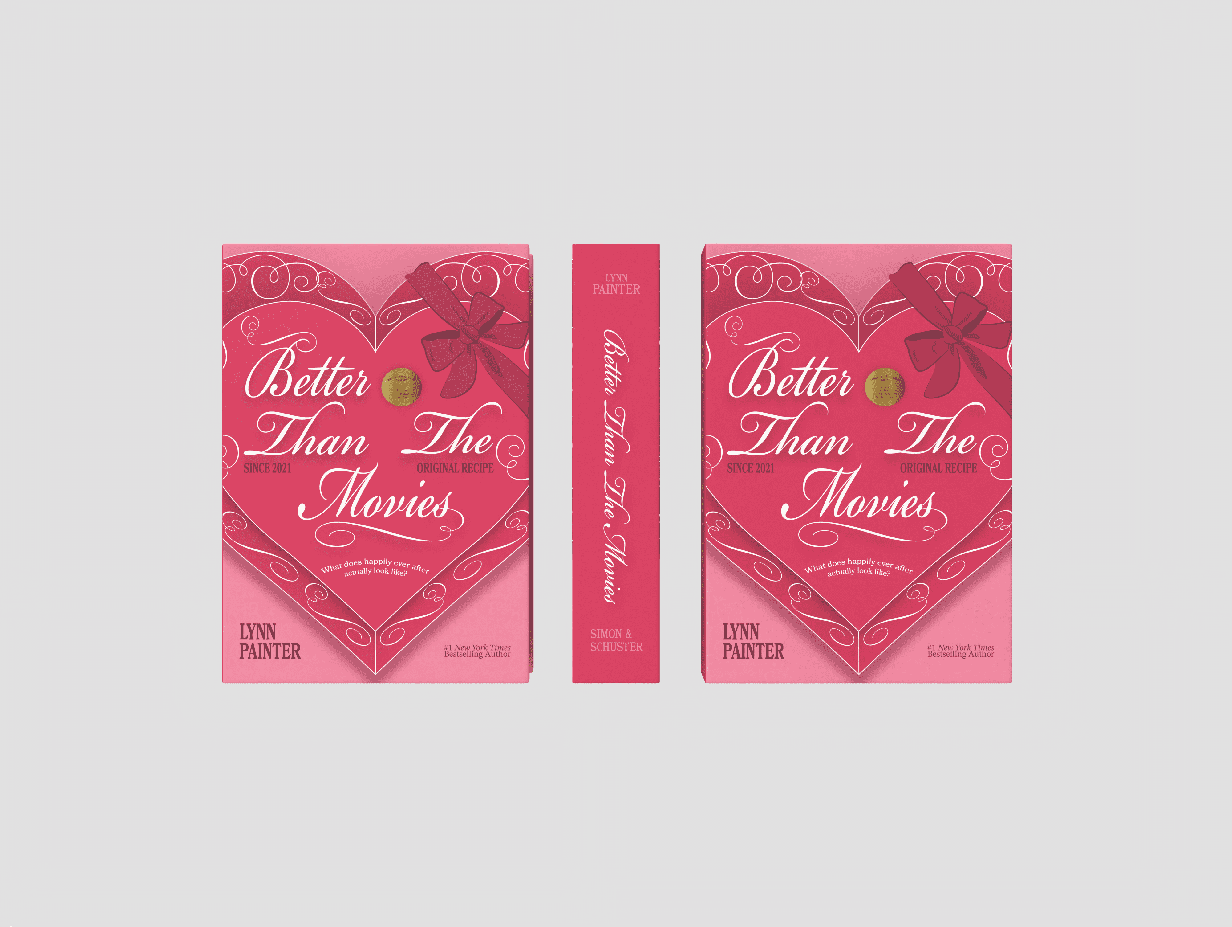
After refining the initial concept, the final design builds on the chocolate box idea with greater depth, texture, and visual balance. While the overall structure remained the same, the focus shifted toward improving scale, hierarchy, and refinement to create a more cohesive and polished result.
To introduce warmth and softness, a subtle lace texture was added to the pink background, giving the cover a cozier, more romantic feel without overwhelming the design. The colour palette was adjusted and softer shadows were introduced to create a more delicate, less rigid appearance. The addition of a bow reinforces the gift-like nature of a chocolate box, drawing on familiar romantic clichés associated with love and indulgence.
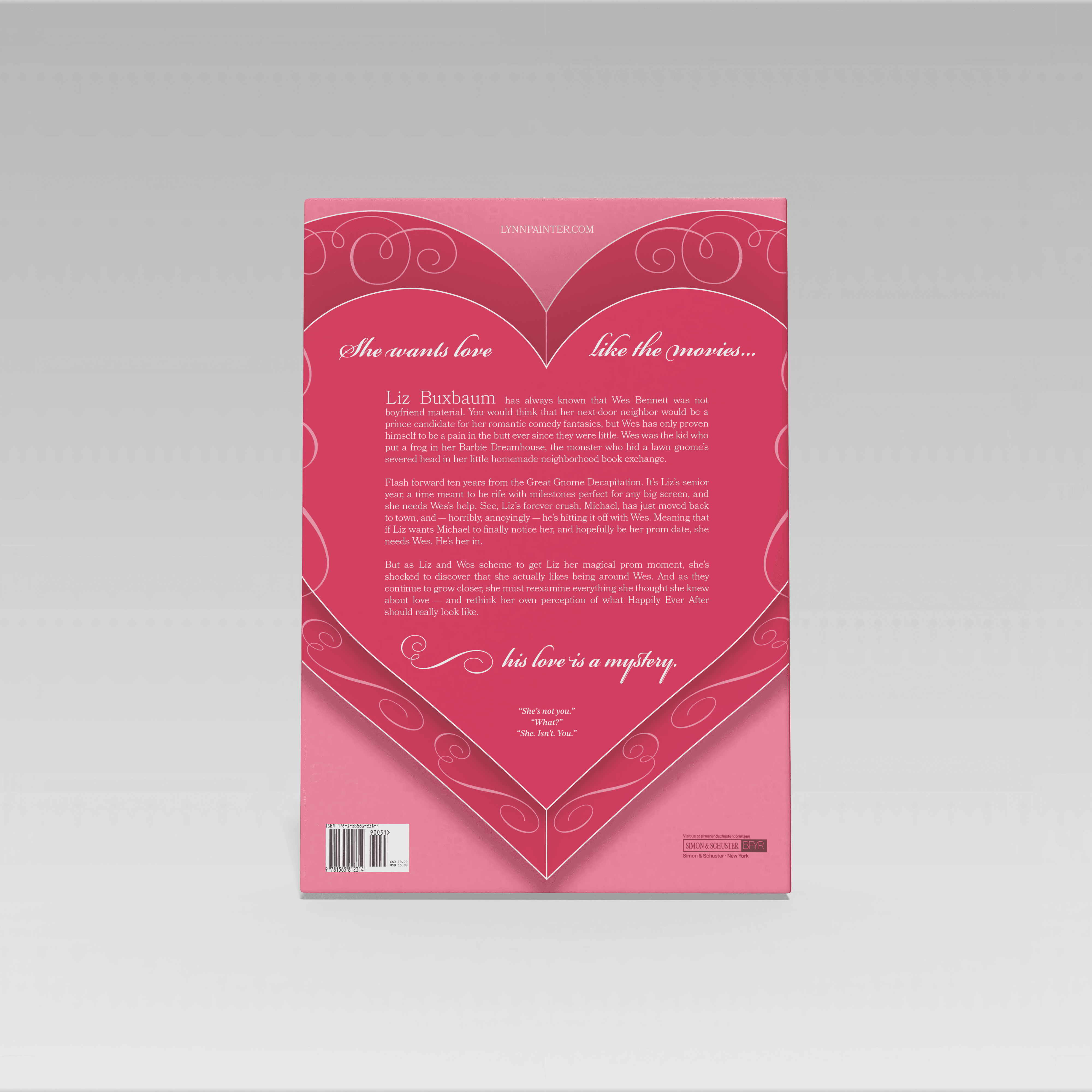
The trope sticker was refined to be smaller and more concise, allowing it to support the design rather than compete with it, while still clearly signalling the book’s genre. Typography and sizing were revisited throughout, including widening the spine to better reflect the hardcover format. For the back cover, the original novel synopsis was used to maintain accuracy and clarity, with the protagonist’s name highlighted to immediately ground the reader in the story. Retaining the phrases “She wants love like the movies” and “His love is a mystery,” along with a key quote from the book, helps quickly communicate character dynamics and overall tone.

Marketing Campaign
Street Marketing
Social Media Post
Since the book ends with a soundtrack created by the author for Wes and Liz, this concept brings that playlist to life through short-form video. Using a sequence of CDs, the post references Liz’s habit of making playlists, which plays a big role in the story. It gives viewers a feel for the mood and emotions of the book through music, letting them experience the story before reading it.
Outcome
Overall, the final rebrand captures the tone and themes of Better Than the Movies in a way that feels intentional and fun. The chocolate box concept reflects the book’s nostalgic, trope-aware nature and leans into the cheesiness that makes the story so lovable. That same energy carries through the advertisements and campaigns, using playful language, familiar rom-com references, and interactive ideas to connect with the audience. Romantic colour palettes, gift-inspired details, and the “tropes as chocolates” concept mirror the protagonist’s love of romance while celebrating classic rom-com storytelling.
Instead of focusing on character illustrations, the rebrand centres on mood and emotion, presenting the book as a collectible experience that feels thoughtful, inviting, and true to the heart of the story.
Explore more of my work
Explore more of my work
Project Type
Branding & Marketing
Duration
4 Weeks
Tools
Photoshop | Illustrator | Procreate | Pacdora
Better Than The Movies
Book Cover Rebrand
A Fresh Look for a Page-Turning Romance
Overview
This passion project began with my love for Better Than the Movies by Lynn Painter—the book that pulled me into romance novels and remains one of my favourites. I’ve always been drawn to Painter’s writing style, her humour, and her unexpected plot twists, and this project became an opportunity to explore how those qualities could translate visually.
While the original cover is strong and widely appreciated, I wanted to challenge myself to reimagine it through a new perspective by creating a special-edition redesign. Although readers are often told not to judge a book by its cover, the cover is frequently the first point of connection—particularly for new or non-traditional readers. The goal of this redesign was to create a cover that feels slightly more mature while still preserving the charm, warmth, and accessibility of Young Adult romance.
Want to skip ahead?
Research Insight - Defining the Purpose of the Rebrand
Problem
Rebranding an Already Successful Cover
One of the main challenges of this project was rebranding a cover that is already well loved. Better Than the Movies has a strong visual identity and a clear connection to its audience, which made it difficult to identify what could be changed without taking away from what already works. Rather than solving an obvious design problem, the challenge became understanding the role of a rebrand when the original cover is already successful.
Standing Out in a Saturated YA Romance Market
YA romance is an extremely crowded and trend-driven category, with many covers relying on similar colour palettes, illustrations, and visual tropes. A key challenge was creating a design that felt distinctive and memorable without blending into existing market trends.
How can a redesign add value to a recognizable cover?
Solution
Reframing the Rebrand as a Special Edition
This challenge was resolved by reframing the project as a special edition rather than a replacement. Instead of trying to improve the original cover, the focus shifted toward creating something that felt additional and celebratory. Drawing inspiration from the book community’s appreciation for alternative and collectible editions, the redesign was approached as a new interpretation—one that honours the original while offering readers a different way to experience a story they already love.
Letting the Story Guide the Design
My solution began by rereading the book multiple times to reconnect with what makes it special—its humor, its romantic cliches, and its heartfelt references to classic rom-com movies. From there, I focused on letting the book itself guide the design rather than the market. The story is playful, romantic, and full of cinematic clichés, so I translated that into a chocolate box–inspired typographic cover. This approach allowed me to emphasize the emotional heart of the story.
Target Audience
Primary Audience - Rom-Com Book Lovers
Age Group
Women readers aged 13–25 years old (Young Adult to New Adult)
These readers gravitate toward cozy, trope-driven romance and often choose books based on emotional tone and overall aesthetic.
They are fans of romance titles such as To All the Boys I’ve Loved Before, and Love & Other Words, which balance humour, emotional depth, and familiarity.
Highly active within online reading communities, including BookTok, Bookstagram, and Pinterest, where aesthetics play a major role in discovery new reads.
Secondary Audience - Rom-Com Movie Fans
These readers are drawn to stories that feel cinematic and nostalgic, reminiscent of classic romantic comedies. They are attracted to covers that convey warmth, humour, and emotional comfort, favouring visuals that are playful yet refined and evoke a movie-like experience.
Secondary Audience - Aesthetic-Driven Buyers
This audience often purchases books as gifts and is drawn to visually appealing objects. Their decisions are influenced by colour palette, typography, and small tactile details. They are particularly attracted to designs that feel display-worthy, whether styled on a bookshelf, desk, or shared on social media.
Audience Needs
A cover that immediately evokes romance, comfort, and a sense of nostalgia.
Clear communication of the book’s tone and genre at first glance.
Visual elements that feel relatable to readers who enjoy romance and familiar tropes.
A design that appears considered, cohesive, and trustworthy.
Subtle references to romance tropes without giving away the story.
A visually engaging cover that feels worth sharing across digital platforms.
Original Book Design (2021)
Design Approach
75123A
D92C5A
F2809C
FFFFFF
Colour Palette
For this redesign, I chose a palette of pink and red tones, including bright fuchsia and warm reddish-pinks. These colours not only evoke romance and the playful energy of rom-coms, but they also create an immediately captivating visual impact.
Typography
I used Bookmania, a serif font for the main text to convey romance and elegance, giving the cover a sophisticated yet inviting feel. To complement the chocolate box concept and playful rom-com clichés, I paired it with Bickham Script Pro 3, a decorative script, adding whimsy and visual interest while tying the design together.
Mood Board
Sketches
During the sketching phase, I used my mood board to help shape the overall direction of the designs, drawing from classic rom-com tropes and a feminine, playful aesthetic that reflects the tone of the novel. Much of this stage focused on exploring typography, where I experimented with different type styles, scales, and placements to make the title a primary focal point.
I also explored a range of layout options for the spine, with particular attention given to the readability and visual presence on a shelf. This phase involved a lot of trial and error, which allowed me to test ideas, refine proportions, and build a strong foundation for the final design.
Draft 1
For the first draft, I explored the idea of reimagining Better Than the Movies as a chocolate box, playing on the notion of romance as something sweet, indulgent, and nostalgic. The front cover was designed to resemble the lid of the box, while the back functions as the underside, helping the book feel like a complete, physical object rather than a flat surface.
To further support the chocolate box concept, I introduced decorative elements such as ornamental linework, a circular “sticker,” and packaging-inspired text including “Since 2021,” “Original Recipe,” and “High Quality Read.” These details draw clear parallels between premium chocolate packaging and the story itself. The inclusion of trope references—such as enemies to lovers, fake dating, and cheesy clichés—was a deliberate way to communicate the book’s genre and themes in a playful and immediately recognizable way.
While the overall concept felt strong, this draft was intentionally exploratory. Decisions around publisher information, scale, and typography—particularly the use of black text—were not finalized and helped reveal what needed refinement. This first iteration ultimately served as a foundation, allowing strengths in the concept to emerge and guiding the direction of later, more resolved designs.
Finalized Book Cover
After refining the initial concept, the final design builds on the chocolate box idea with greater depth, texture, and visual balance. While the overall structure remained the same, the focus shifted toward improving scale, hierarchy, and refinement to create a more cohesive and polished result.
To introduce warmth and softness, a subtle lace texture was added to the pink background, giving the cover a cozier, more romantic feel without overwhelming the design. The colour palette was adjusted and softer shadows were introduced to create a more delicate, less rigid appearance. The addition of a bow reinforces the gift-like nature of a chocolate box, drawing on familiar romantic clichés associated with love and indulgence.
The trope sticker was refined to be smaller and more concise, allowing it to support the design rather than compete with it, while still clearly signalling the book’s genre. Typography and sizing were revisited throughout, including widening the spine to better reflect the hardcover format. For the back cover, the original novel synopsis was used to maintain accuracy and clarity, with the protagonist’s name highlighted to immediately ground the reader in the story. Retaining the phrases “She wants love like the movies” and “His love is a mystery,” along with a key quote from the book, helps quickly communicate character dynamics and overall tone.
Marketing Campaign
Street Marketing
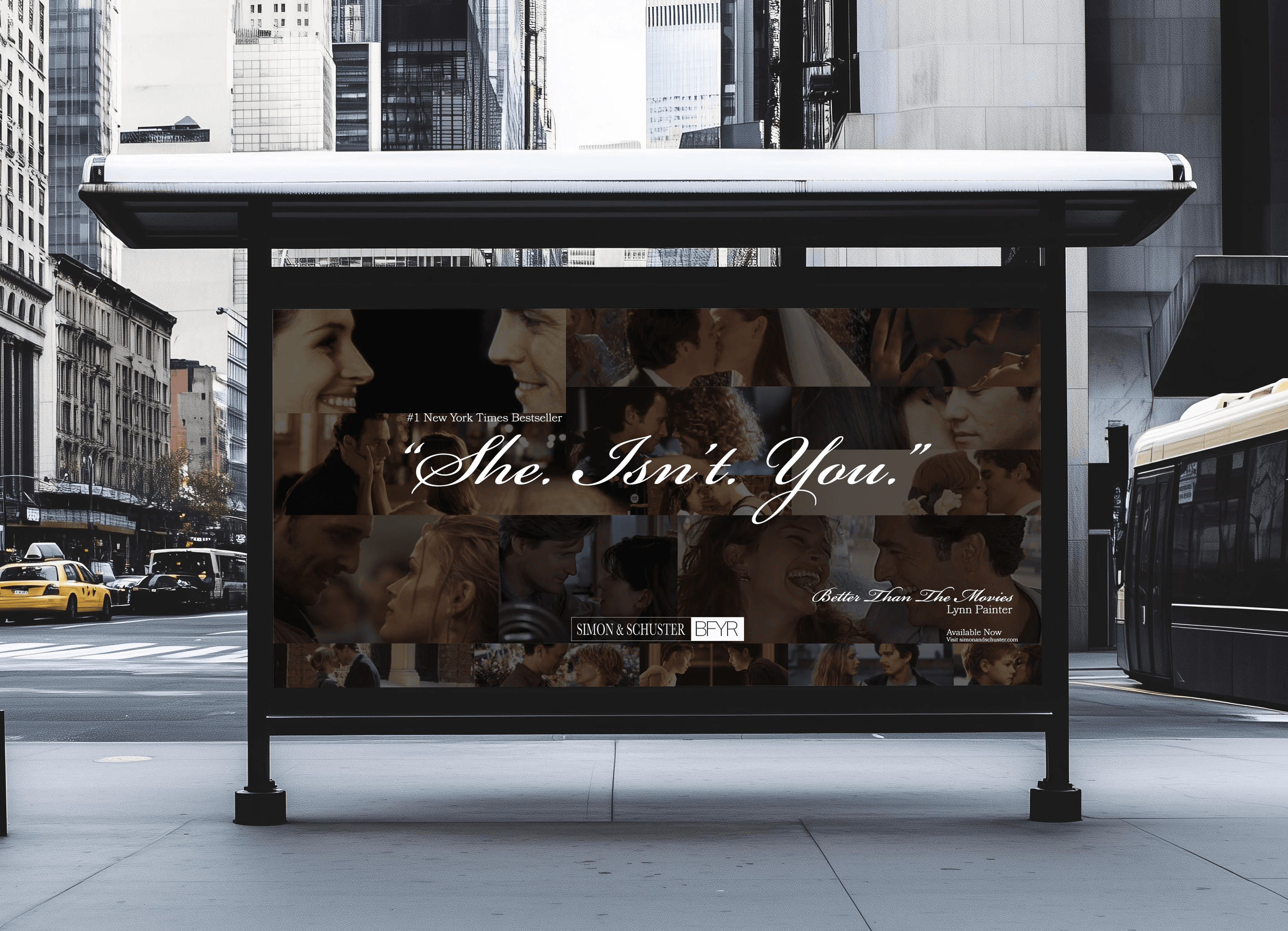
This first street marketing piece was designed to clearly communicate the book’s brand. The background features a photo montage of iconic rom-com films quoted throughout the book—such as Love Actually, 10 Things I Hate About You, and Two Weeks Notice. This not only pays homage to the genre but also signals to audiences that the story is made for rom-com lovers. The phrase “She isn’t you”, a direct quote from the novel, highlights the male main character’s devotion and gives a glimpse into the emotional core of the story.
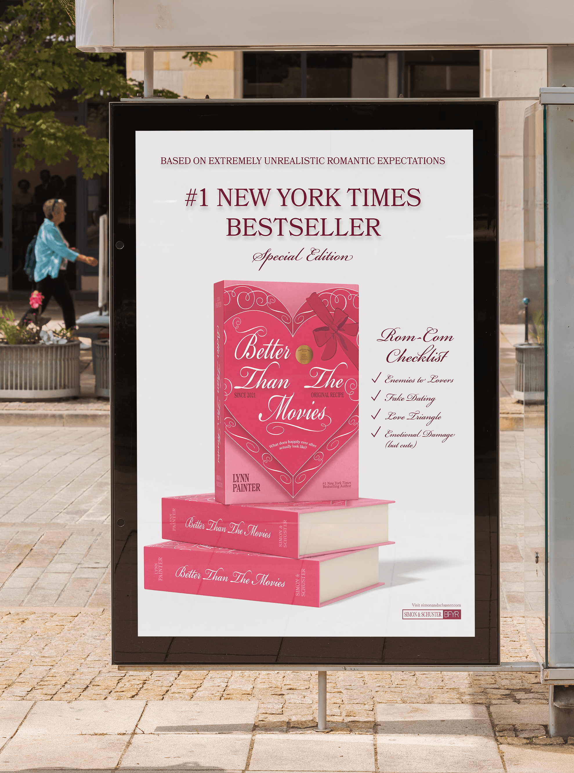
The next piece is more advertising-driven, focusing on clear promotion while still staying playful. The ad features the special edition book front and centre, followed by a bold New York Times #1 Bestseller headline. To add humour and personality, the line “Based on extremely unrealistic romantic expectations” is used as a lighthearted hook that immediately reflects the book’s rom-com tone. The special edition callout reinforces exclusivity, while a trope-style checklist acts as a fun, visual way to summarize the story. Key information is still included at the bottom, but overall the ad leans into whimsy, proving that marketing can be informative without losing its sense of play.
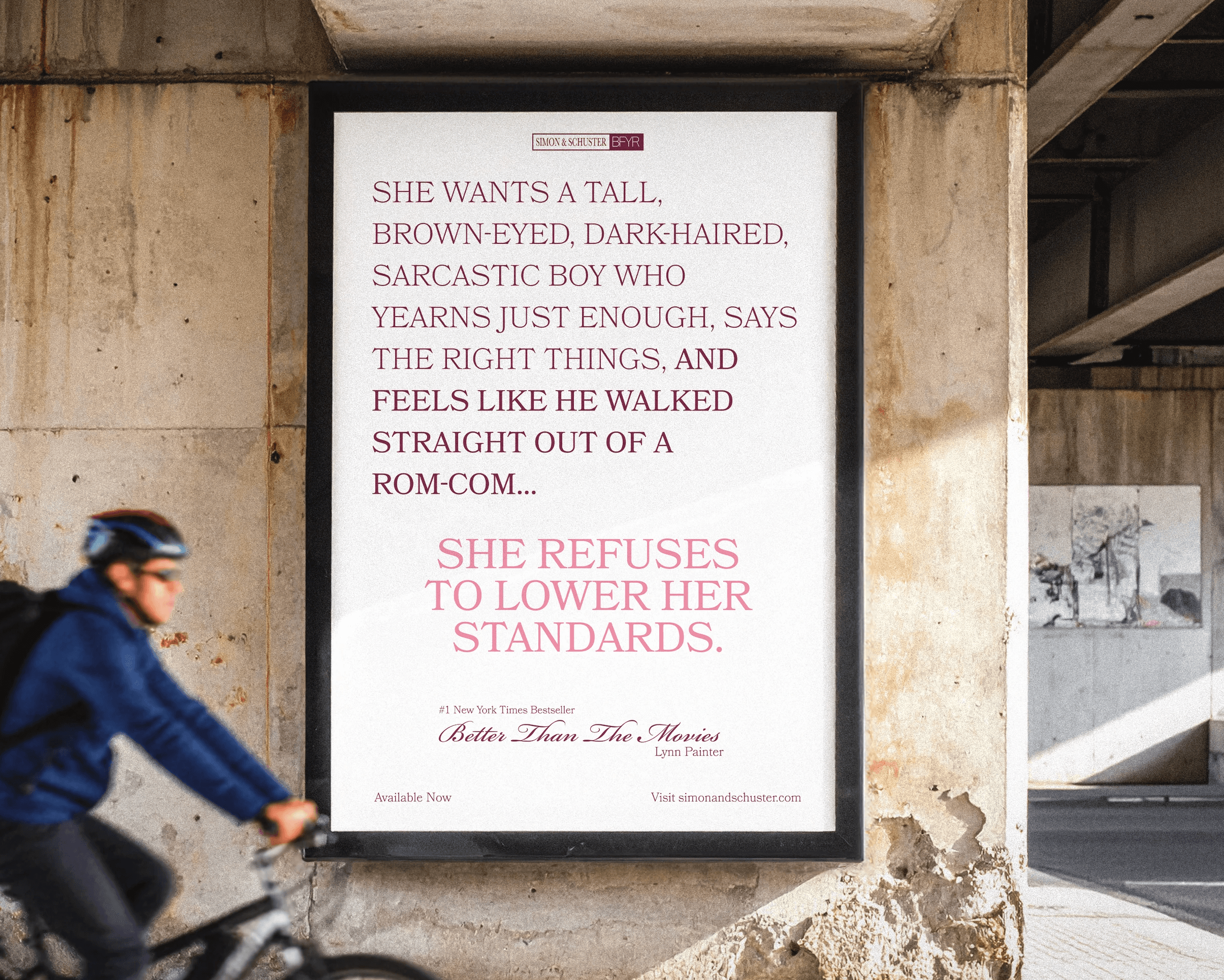
The next ad pays tribute to the female protagonist, Liz, and her unapologetically high standards when it comes to love. Inspired by the idea that many people—especially rom-com fans—have a clear “type” or checklist in mind, this piece connects with audiences through relatability and empowerment. The bold headline “She refuses to lower her standards” celebrates Liz’s confidence while subtly hinting at the male main character readers will come to love. By listing traits the ad allows viewers to envision the love interest before reading the book. Supporting details such as the title, author, and availability anchor the concept.
Social Media Post
The final piece is a social media post made for both Instagram and TikTok. Since the book ends with a soundtrack created by the author for Wes and Liz, this concept brings that playlist to life through short-form video. Using a sequence of CDs, the post references Liz’s habit of making playlists, which plays a big role in the story. It gives viewers a feel for the mood and emotions of the book through music, letting them experience the story before reading it.
Design Challenges
Problem 1: Visual Hierarchy in a Decorative Layout
One of the main challenges was maintaining a clear visual hierarchy within a highly decorative design. With ornate linework, script typography, and multiple informational elements in play, there was a risk that the decorative details could overpower the title and key information instead of supporting them.
Solution
I addressed this by refining the typographic hierarchy and adjusting spacing across the cover. The title was given the largest scale and strongest contrast, while secondary elements like taglines and decorative accents were scaled back to support rather than compete with it. This approach helped the cover stay readable and visually balanced at a glance.
Problem 2: Creating Depth Without Overcomplicating the Design
Another challenge was making the cover feel dimensional and tactile—like a real chocolate box—without overcrowding it. Adding too much depth or shading could easily make the design feel cluttered or heavy.
Solution
To address this, I used subtle techniques such as soft shadows, layered shapes, and light background textures to create depth. These small, restrained adjustments made the cover feel more engaging and three-dimensional while keeping the overall design clean and refined.
Outcome
Overall, the final rebrand captures the tone and themes of Better Than the Movies in a way that feels intentional and fun. The chocolate box concept reflects the book’s nostalgic, trope-aware nature and leans into the cheesiness that makes the story so lovable. That same energy carries through the advertisements and campaigns, using playful language, familiar rom-com references, and interactive ideas to connect with the audience. Romantic colour palettes, gift-inspired details, and the “tropes as chocolates” concept mirror the protagonist’s love of romance while celebrating classic rom-com storytelling.
Instead of focusing on character illustrations, the rebrand centres on mood and emotion, presenting the book as a collectible experience that feels thoughtful, inviting, and true to the heart of the story.
Explore more of my work
Explore more of my work